Notes & Observations
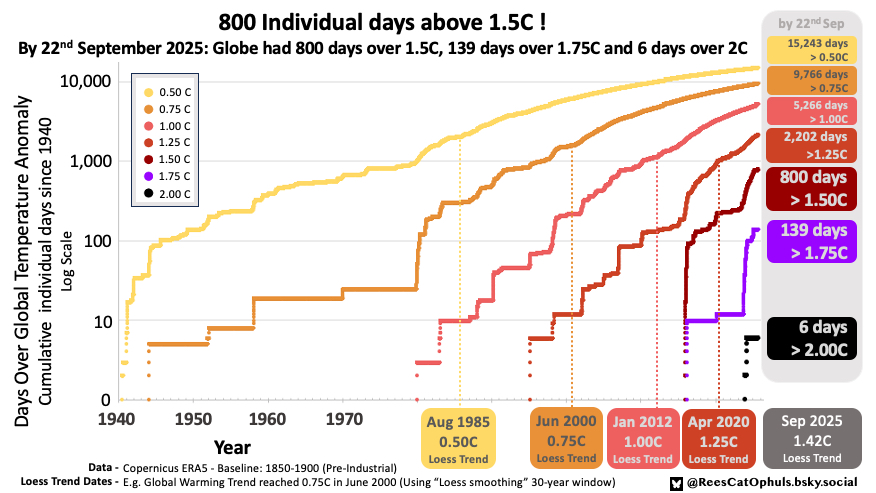
- Cumulatively, we have now had 800 days, where the Global Surface Temperature Anomaly is over 1.5C (See bottom of page for methodology).
- 2025 started very hot, but then went below 2023/2024 levels for the summer, with most GMST Anomalies between 1.0C and 1.4C.
- It does seem (lay person observations, and listening to the experts), that the winters are warming faster than the summers, so it shouldn’t be a surprise to see the biggest GMST anomalies in September -> March. Note that the global temperatures tend to align with the Northern Hemisphere Winter/Summer. I’m going to guess that that is due to there being more land in the Northern Hemisphere.
- As per Trends and Projections – The Loess (30 year window) moves around, as new data is added, especially the most recent 10-15 years, so the dates at which the “Loess Trend” line crosses different Global Warming Milestones keep moving.
- See the “Notes and Observations from “Graph Version 4” below, (and previous versions below that)
Graph version 4 – Feb 2025
- The values for 1.75C and lower keep ramping up.
- As per Trends and Projections – The Loess (30 year window) moves around, as new data is added, especially the most recent 10-15 years, so the dates at which the “Loess Trend” line crosses different Global Warming Milestones keep moving.
- See the “Notes and Observations from “Graph Version 3” below.

Graph version 3 – January 2025
Notes & Observations
- When will the loess-30-year trend line first cross 1.5C ? … and when we look back years later, where will the loess-30-year trend line eventually settle as the first month over 1.5C.
- I’m going to punt a guess at 2028, and then years later it will settle on 2027
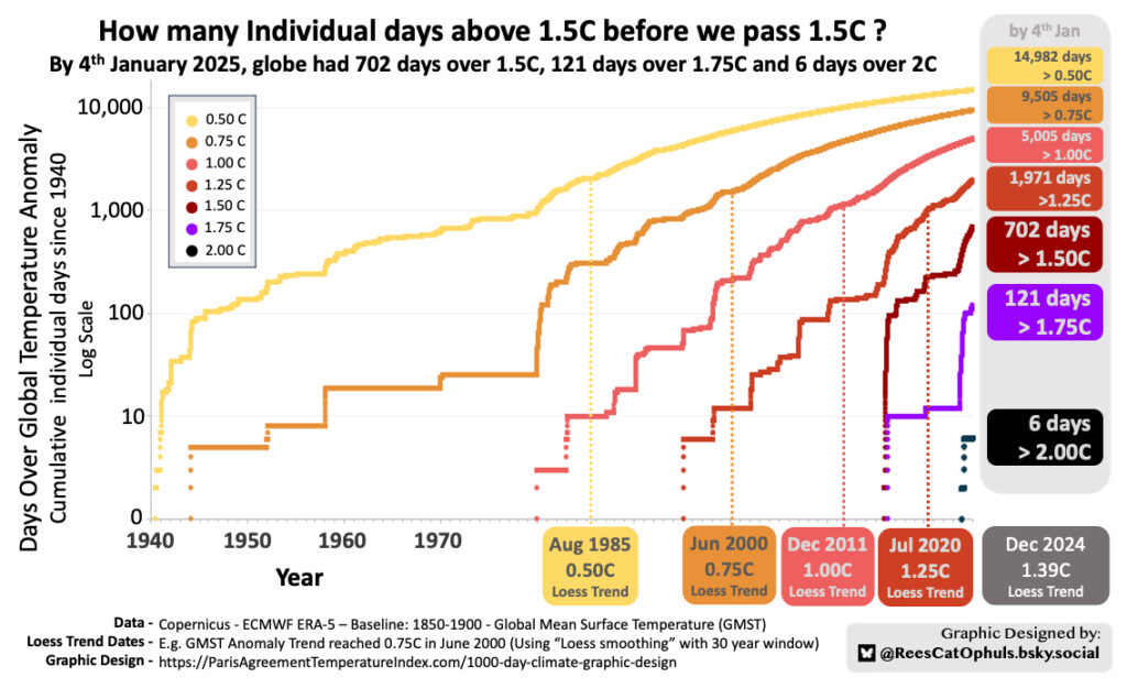
- The count of days over 1.5C has been going up fast !
- We are not over 700 individual days over 1.5C
- Over 75% of last 365 days were over 1.5C
- 458 of the last 674 days were over 1.5C
- We had another surge in days over 1.75C
- We had a big surge from Oct 2024 to Jan 2025 (21 days)
- Previous to that, there was the initial surge between Sep 2023 and April 2024 (88 days)
- The first time we had days over 1.75 was in 2016 (12 days)
- The Dates at which the trend crosses various milestones is subjective
- As per Trends and Projections video
- The “Loess 30 year trendline” moves around, as additional data is added
- The date at which the “Loess 30 year trendline” crossed 1.25 shifted from Dec 2022, forwards to July 2020, because we have had so many warm months in 2023/24, which have “pulled” the trend line up.
- Picking a useful trend line smoothing technique (20-year average, 30 year average, 15 year average + 15 year model predictions, loess 10 year, loess 20 year, loess 30 year, quadratic best fit, linear best fit) is the subjective part. It is basically impossible to choose an “Objectively True” trend line, so one can only make a judgement on a trend line that seems to give a “fair” result.
- Once you have picked you trend line smoothing technique, then the results are calculated, and the trend line has the pro’s / con’s inherent in its design.
- As per Trends and Projections video
- See sections below for previous versions of this graphic, and how it is created
Graph version 2 – October 2024
Cumulative days over Global Temperature Milestones
Following my frustrations with Climate Reporting – Why so many different values, and the 6 individual days where GMST was above 2C (E.g. above the upper limit of the Paris Agreement) … I was starting to wonder, for how long we would have experienced these high temperatures before the “GMST Trend Temperature” was agreed to have passed these temperature milestones. E.g. when will it be before the Paris Agreement 1.5 / 2.0 Limits are agreed to have passed.
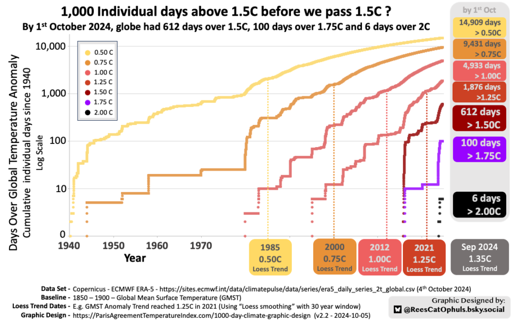
This graphic above (Beware: log scale), clearly shows when the world first experiences a single day above a global temperature milestone, and shows how rapidly that new temperature milestone becomes a regular occurrence. Within a few years, after “GMST Trend Temperature” passes a milestone, the curves become very smooth, because virtually every day after that is over that milestone.
Graph – 2nd Version October 2024
The second version of this graph was created using Copernicus ERA-5 daily GMST temperatures up to 1st October 2024.
- 612 individual days above 1.50C Paris Agreement global temperature target
- “GMST Trend Temperature” is well on its way to 1.5C
- 100 individual days over 1.75C (Note: no change here, from April 2024)
- 6 individual days over 2.00C Paris Agreement global temperature target
- Improvements in second version
- Trend line
- The first version talked of a year when “climate reached” a milestone, and this used a home-made smoothing function, which was a mix of centre-moving-average and linear-best-fit.
- The second version used standard “Loess Smoothing” with a 30-year-window, to calculate the years which the “Loess Smoothing Trend Line” passed various milestones.
- This actually made surprisingly little difference.
- 1st version stated that we passed 0.5C in 1984. This second version shows Loess Smoothing Trendline passes 0.5C in 1985.
- 1st version stated that we passed 1.25C in 2020. This second version shows Loess Smoothing Trendline passes 1.25C in 2021.
- Counts
- As per Copernicus 1850-1900 Baseline – Daily GMST Anomaly, I did a deep dive into some differences between the numbers I got for Copernicus data relative 1850-1900, versus those published by Copernicus themselves (in their monthly bulletins)
- The differences were only around 0.03C for any given day.
- The improvements mean the counts for cumulative days over 0.5C, 0.75C, 1.00C, 1.25C were changed by about 0.2%. The counts for 1.5C, 1.75C, 2.0C were not affected.
- Twitter / X feedback
- I had some really useful criticism / feedback from the graphic’s first posting on Twitter / X.
- Trend line
Graph – 1st Version – April 2024
The first version of this graph was created using Copernicus ERA-5 daily GMST temperatures up to 2nd April 2024.
- 506 individual days above 1.50C Paris Agreement global temperature target
- “GMST Trend Temperature” is well on its way to 1.5C
- 100 individual days over 1.75C
- 6 individual days over 2.00C Paris Agreement global temperature target
- Note that the Y-Axis is Logarithmic.
I wanted to tie together the accumulating individual days above various GMST Milestones, to “The Climate”. This is overreach by me. For future postings of the graphic (with the latest data), I will use a more anodyne “GMST Trend °C” … E.g. when do my trend lines pass various “GMST Milestones”, being clear about what trend line algorithm I use.
Key Data Points Show Accelerated Warming
The table below appears to show accelerating warming:
- Note:
- The table was updated in Oct-2024, as I moved to Loess Smoothing with a 30-year-window
- This page only uses Copernicus ERA5 data.
- The years between “GMST Milestones” keeps dropping:
- 15 years from 0.5C to 0.75C, but only 9 years from 1.00C to 1.25C
- The cumulative number of days to reach a “GMST Milestone” keeps dropping:
- Well Over 2,000 individual days above 0.5C before “GMST Trend Temperature” reaches 0.5C
- Just over 1,000 individual days above 1.25C before “GMST Trend Temperature” reaches 1.25C
| GMST Milestone | First Day over GMST Milestone | First Year “GMST Trend Temperature” Crossed Milestone | Cumulative Individual Days above Milestone, before “GMST Trend Temperature” reaches Milestone | Cumulative Days above Milestones by October 2024 |
| 0.50 C | Apr 1940 | 1985 – September | Around 2,000 | 14,900 + |
| 0.75 C | Feb 1941 | 2000 – April | Around 1,500 | 9,400 + |
| 1.00 C | Jan 1958 | 2012 – January | Around 1,100 | 4,900 + |
| 1.25 C | Feb 1995 | 2021 – March | Around 1,000 | 1,800+ |
| 1.50 C | Dec 2015 | Guess: 2028-33? | – | 600+ |
| 1.75 C | Feb 2016 | Guess: 2035-40? | – | 100 |
| 2.00 C | Nov 2023 | Guess: 2045-50? | – | 6 |
How the Graphic was constructed
The graphic uses the “Copernicus ERA-5” daily Global Mean Surface Temperatures (GMST) , together with “Daily Anomalies” (See GMST Data Sets). This allowed me to get the Daily GMST above the 1850-1900 baseline.
For each day between January 1940 and April 2024, the graph simply counts the cumulative number of days that were above 0.5C, 0.75C, 1.00C, 1.25C, 1.50C, 1.75C, 2.00C. The Y-Axis is Logarithmic, so that it can fit the 14,000+ days over 0.5C on the same graph as the 6 days over 2.0C.
The Year at which the “GMST Anomaly Trend Temperature has Reached <X>°C”, is somewhat subjective, however using various smoothing techniques that give believable “GMST Anomaly Trend Temperature” lines, it only most only makes 0-2 years difference for any given data set. Currently (Oct 2024 onwards) I am using Loess-Smoothing with a 30-year-window on the Copernicus data.
- Climate Milestones – NOAA, GISS, Copernicus, HadCRUT, Berkeley Earth
- Determining the “GMST Trend Temperature” using multiple GMST Data Sets and smoothing functions
- Climate Milestones Copernicus – ERA5
- Determining the “GMST Trend Temperature” using just the Copernicus Data set (See GMST Data Sets) and two different smoothing functions
- As per Climate Reporting – Why so many different values
- If you did the same graphic, but with different data sets (E.g. one with “Berkeley Earth” and another with NOAA), you could get up to 7 years difference in the dates, as their “trend / smoothed” data varies by up to 0.17C
Page History
5-October-2024 – Updated to Loess Smoothing
As per Log of Updates and Errata updates in Oct 2024, I moved away from a hand-woven smoothing technique, and moved towards using Loess Smoothing with a 30-year-data window. This didn’t make a huge difference, but is a popular smoothing technique.
7-April-2024 – Updates in progress…
Following feedback on Twitter / Blog – I am making a few changes
- Replaced terms:
- “The Climate” with “GMST Trend Temperature”
- “Climate Milestones” with “GMST milestones”
- It was pointed out that “The Climate” is not the best term. I guess it is also “overreach” on my part. I don’t want to distract from the main message of the graphic, so choosing a less “punchy” title / terminology.
- I’m expecting to post updates of the graphic every month, so the key title will just be a count of the days over various GMST milestones.
- Adding “+/-” range to the “year that the “GMST Trend Temperature” crossed a “GMST-milestone”
- This is to reflect the subjective nature of these years and the trendlines.
- I need to find a better trend-line-algorithm. Maybe “Loess”
- Some people lost confidence in the graphic, because it shows such an early crossing of 1.25C GMST-Milestone. The trend lines are above the year-average temperatures for 2021 / 2022. This is actually ok, because 2021/22 were La Nina years and you would expect some years to be above, and others below a trend line.
- Better title and y-axis name
- Add an additional label on the right, about the the “days > 0.5” .. being cumulative since 1940
- Some people thought it was “x days over 0.5C, since trendline passed 0.5C”
- … whereas it is actually “x individual days above 0.5C since Jan 1st 1940”
- Added a better graph to Climate Milestones Copernicus – ERA5, to show more clearly how the “TrendLines” weave their way between individual yearly averages. Some years (E.g. 2021 / 2022) will be below the Trendline, and others (notably: 2016, 2023, start-of-2024) will be above the trend line.
- Improvements still needed
- Need better colours. Need to find a standard palette for GMST Milestones