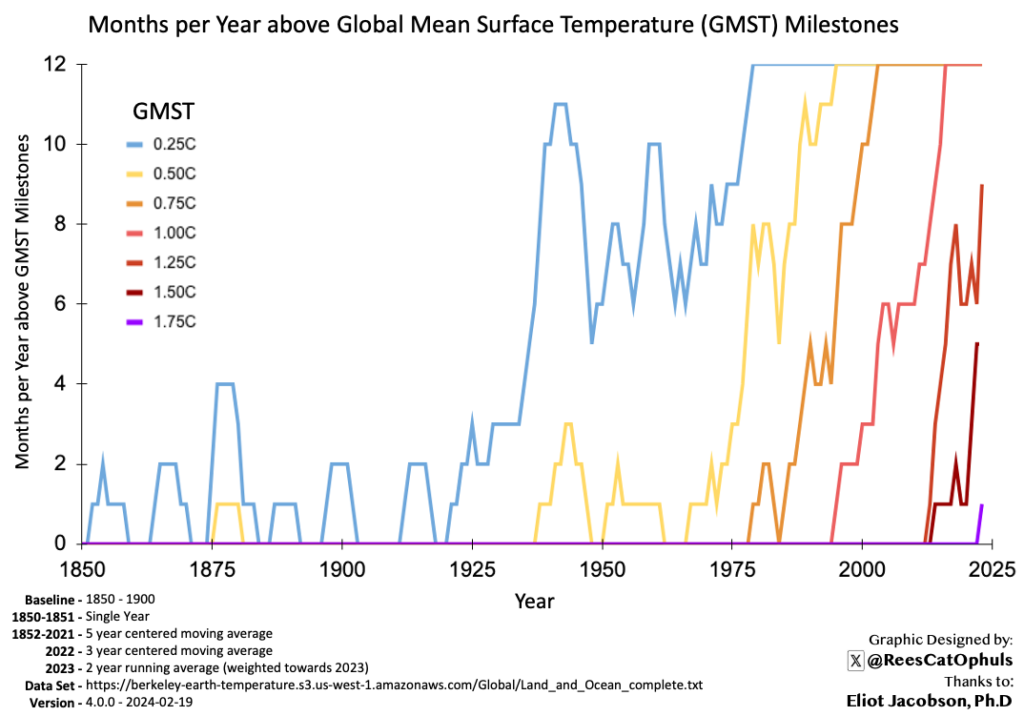
The 2025 update posted on Bluesky. Things to note:
- That’s three years in a row, where there was at least one month with 1.75C or over.
- The last three years 2023, 2024, 2025 have had: 6, 11, 6 months with 1.5C or over, which with the smoothing (including last two years weighted towards 2025) has the line showing 6months per year >= 1.5C
- Zeke Hausfarther and James Hansen are predicting a slightly cooler 2026 (~1.4C) and then and new record warm year in 2027 (Depending on El Nino appearing as forecast).
2025 – Raw months-per-year without smoothing

2024 Version below

Observations
- As per the “How the graph was created” section below, there is some data smoothing, to get the trends to show up more clearly. This means that the “number of months per year” is not exact for any given year. See the “Raw Counts Graph – No Smoothing” for the actual numbers.
- As per the “Raw Counts Graph – No Smoothing” graph lower down this page (E.g. the data without any smoothing)
- 2024: All 12 months were over 1.25C
- 2024: 11 of 12 months were over 1.5C (Only July was below 1.5C)
- 2023 has 2 months over 1.75C, and 2024 had 1 month over 1.75C
- From 2016 -> 2024 (inclusive), almost half the months (5.75 months-per-year) were over 1.25C
- The lines for 1.25C, 1.50C and 1.75C are surprisingly close together and surprisingly steep
- The gaps (in year) between each milestone appears smaller than the last
- The gradient for each new milestone is steeper than the last
Differences from Previous Posting of this graphic
- I previously posted a version of this graphic on X (Feb 2024) and BlueSky (Aug 2024)
- Previous version used “Berkeley Earth” data. Which as per Climate Reporting – Why so many different values) runs slightly warmer than Copernicus
- Previous version had data 1850 -> Present (Copernicus data only goes from 1940)
- Previous version used 5-year-centre-running-average, but 3-year seems fine.
How the Graph Was Created
- Get the Copernicus ERA5 latest data (See GMST Data Sets)
- Calculate the daily anomalies. relative to 1850-1900 (See Copernicus 1850-1900 Baseline – Daily GMST Anomaly)
- Get the monthly Anomalies (Just maths)
- For Each year, count how many of the months, in that year, were over each “warming milestone”, that we are interested in. E.g. 0.5C, 0.75C, …, 1.5C, 1.75C
- The “Raw Counts Graph – No Smoothing” shows the plot of these numbers, it is a bit too jumpy to see the trends
- For each year, get the 3-year centre moving average for each “warming milestone” (E.g. for 2020, for the 0.5C milestone, get the number of months over 0.5C for 2019, 2020, 2021)
- For 2024, we can’t get a “3-year centre moving average” (We don’t know what will happen in 2025, so I took a 2 year average weighted 2:1 towards the 2024 numbers. Not ideal, but the graph is only really to paint a picture of what is happening.
- Each “Months per year” value is rounded to the nearest whole number
Raw Counts Graph – No Smoothing
Below, is the same graph as above, but doesn’t use any smoothing for the “months per year” numbers.
As you can see, it is more accurate, but also a little bit more messy, and slightly harder to see the trends.

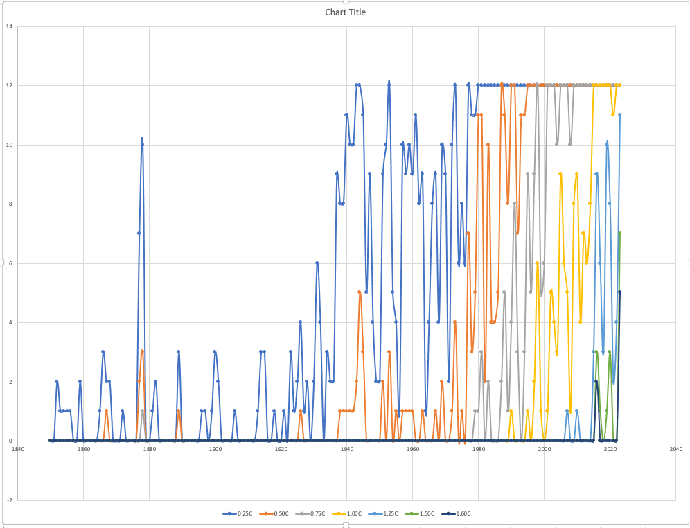
Version 1 – Months Per Year – 1850 to 2023 – Berkeley Earth Data
Below is the first version of this graphic, which was posted for data up to the end of 2023
- BlueSky: August 2024: https://bsky.app/profile/reescatophuls.bsky.social/post/3kzwith3ztl2l
- TXitter: Feb 2024: https://x.com/ReesCatOphuls/status/1759985059656876078
Description
The graph counts shows how many months had an average-global-monthly-temperature above a given temperature milestone for each year, up to December 2023 (inclusive)
E.g. in 1975 there were 9 individual months averaging above 0.25C and 3 months above 0.5C.
As per section at the bottom of this page, the graph does have some smoothing to clean up the trend lines.
Interesting Observations
- You can see the time it takes for a global temperature milestone to have it first monthly average value pass a global temperature milestone, until that milestone happens for every month of the year.
- E.g. A month above 0.75C first appears in 1979, and by 2003 all 12 months of every year are above 0.75C.
- The graphic appears to show acceleration.
- Each milestone appears to take less time to go from first appearance, to a permanent part of the climate. The lines for the different milestones get steeper.
- From 2014 things ramped up with months over 1.25C and over 1.5C happening almost at the same time. That said, it looks like there 1.5C started later than one might expect. Maybe some mix of natural variability, ENSO in La Nina phase, solar cycle minimum, increased aerosols. Who knows. I’ll have a look out for explanations
- In 2023 we started to get Months above 1.75C
- What is not on the graphic
- Months in 2024 are not included.
- You can’t see the individual 2C days that happened in November 2023 and February 2024.
- Note that (as per Climate Reporting – Why so many different values), Berkeley Earth tends to report higher than the other key datasets (see GMST Data Sets), E.g. it is runs about 0.08C (3 years) ahead of Copernicus, and runs about 0.17C (7 years) ahead of NOAA / GISSTemp.
How the Graph was Created
This graphic uses the Berkeley Earth Dataset (See GMST Data Sets), which provides monthly average Global Mean Surface Temperatures (GMST) from 1850 until the present.
For each year, between 1850 and 2023 (inclusive), the graphic simply counts the number of months which are greater-or-equal to monthly temperature milestones.
The graph of the raw data is below. This is quite jumpy, so for the graphic at the top of the page (which was shared on twitter / X), I used a 5-year-centred average, with some rounding to get cleaner lines. For 2022 I used a 3-year-centred-average, and for 2023 I took an average of 2022 / 2023 weighted towards 2023.