Update to the version I posted in December 2025. I changed the white labels at the end to be: 1946, 1966, 1986, 2006, 2026.
Sanity tests: The previous version is written as a python program, so it was mostly just re-running that programme. I tested it by side-by-side comparison of last year video and this (comparing stills of the same frame), and checking the monthly values from 2025 matched those posted by Copernicus.
Check Copernicus monthly values:
- 1.47°C – https://climate.copernicus.eu/surface-air-temperature-january-2026
- 1.49°C – https://climate.copernicus.eu/surface-air-temperature-february-2026
- 1.48°C – https://climate.copernicus.eu/surface-air-temperature-march-2026
- 1.43°C – https://climate.copernicus.eu/surface-air-temperature-april-2026
- 1.42°C – https://climate.copernicus.eu/surface-air-temperature-may-2026
- 1.39°C – https://climate.copernicus.eu/surface-air-temperature-june-2026
… The spiral graph matches. Note, that the spiral graph shows the 30-day-running average, so you need to look at the point half-way after the month. E.g. for March-2026, the graph will hit 1.48°C on the last day of March (which is half way between the March label, and the April label) because the last day of March has the 30 day average including all the days in March.
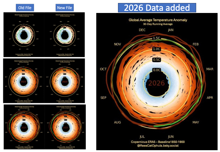
Spiral up to Dec 2025
Update to the version I posted in November 2024. I did make a few changes. I repeated the images (the stills that make up the video) twice, to effectively halve the speed of the video. I changed the white labels at the end to be: 1945, 1965, 1985, 2005, 2025.
Sanity tests: The previous version is written as a python program, so it was mostly just re-running that programme. I tested it by side-by-side comparison of last year video and this (comparing stills of the same frame), and checking the monthly values from 2025 matched those posted by Copernicus.
2024 – November version
The original
Observations
- No surprise: 2023 and 2024 have been absolutely nuts
- 2023 / 2024 have been circling around and past the 1.5C paris agreement lower limit
- 2024 pretty much guaranteed to be over 1.5C.
- You can see 2016 jump over 1.5C
Sanity Checking the Graphic
- Given that I am using a running 30 day average, and then plotting every day (ignoring any leap years)…
- Each year has exactly 365 data points (apart from 1940 and 2024)
- For months with 30 days, the last day of the month, should exactly match the “Monthly Bulletins” posted by copernicus
- All non-30-day months should be pretty close to the copernicus bulletin temperatures, but not exactly the same
- Test:
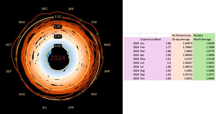
- The top image below shows
- On the left: All years in the spiral, viewed from the top (2024: 1st Jan -> Nov 16th)
- On the right: a table showing
- Monthly anomaly numbers from copernicus
- My 30-day-average-anomaly plotted on the graph
- My monthly-average data that underlies my graphic. From GMST Data Sets
- They match great
- The Green dots are the 2024 monthly temperatures
- These are the anomalies for each 2024 month, posted by Copernicus in a BlueSky “skeet” (see bottom image below).
- The Green dots underlay the 2024 line very nicely
- I have done other tests, but I’m not posting them here.
- The top image below shows

How this Graphic was created
- Inspired by a video
- Featuring “Climate Extremes: At The Abyss?”, on YouTube, featuring Johan Rockström (Director of Potsdam Institute of Climate Impact), Dr Sam Burgess, Daniel Swain, Ph.D.
- Good grief, it was more complex and refined than I thought it would be.
- I was annoyed that
- The original was not baselined to pre-industrial
- The original stopped in 2021
- The video was talking about how bad 1.5C is, but then kept choosing graphics that weren’t baselined to pre-industrial (so 1C heating on the graphic wasn’t the same as 1C above pre-industrial
- I raised this with Daniel Swain, who kindly replied, but I wasn’t hugely satisfied with the answer.
- I totally underestimated how much refinement had gone into the original
- How hard could it be.
- Well the basic wasn’t too bad. A few hours. The refined version … too embarrassed to mention.
- Get the Copernicus Data (See GMST Data Sets)
- Calculate the daily Anomaly vs 1850-1900 (See Copernicus 1850-1900 Baseline – Daily GMST Anomaly)
- Get rid of leap year (every day 366 for a leap year was discarded), to make things easier
- Run a 30-day-average, so that each day now represents the average anomaly of the previous 30 days
- Plot a line for every day of each year from Feb 1940 -> November 16th 2024
- Plot on a 3D graphic, where each line is plotted
- Each line joins one data point, to the next. E.g. one line from Jan 1st -> Jan 2nd
- Z-axis is the year. So 1940 at the bottom, 2024 at the top
- In a circle: Jan at the top, April to the right, July at the bottom, Oct on the left
- The distance from the centre is the “anomaly vs 1850-1900”
- The colour goes from Blue -> Red. Blue being colder anomaly. Red being warmer anomaly
- Design it, so you choose how many “frames per year”, and have this variable
- For every frame, have the “leading data point” lime green, and fade it back to its orginal poper colour, by the time you get to 1 year before the leading point.
- You need this, otherwise it is hard to see the latest year being added
- Refinements
- While viewing from the top
- Year is shown in the middle (colour matches year anomaly)
- Yellow concentric circles, for anomalies: 0C, 0.5C, 1C, 1.5C
- Months listed around the outside
- Last 12 months plotted are lime green, fading back to their proper “anomaly colour”
- I modified the number of frames-per-year to balance how large the file is, how long the video takes, and prioritise more time on the later years. I was aiming for under 3MB
- Transition from top view to side view
- Over about 15 images, swing the view from the top to the side
- Get rid of the concentric yellow lines
- Get rid of the month labels
- Side view
- Years now look like “pancakes” stacked on top of each other
- Fade in vertical lines to show the anomalies: 0C, 0.5C, 1C, 1.5C
- While viewing from the top