I was wondering when we could see our first year, where Global Warming reached 2°C.
Climate Scientists and institutions have published various projections for how Global Warming might proceed.
If I use these projections and make a few assumption about natural variability, I can come up with plausible dates after which we might see the first day, first month and first year over various global warming milestones (1.5°C, 2.0°C, 2.5°C, 3.0°C). Also this would show dates by which we may have seen the last day, last month, last year under various Global Warming Milestones.
I’m planning to update these graphics every year, to see how they compare to reality. I have added a RMSD value (Root mean square difference) as a metric to see which one has the best match to what we are experiencing (lowest RMSD value is the best match).
#1 – Global Warming – 0.3°C per Decade – Inspired by James Hansen
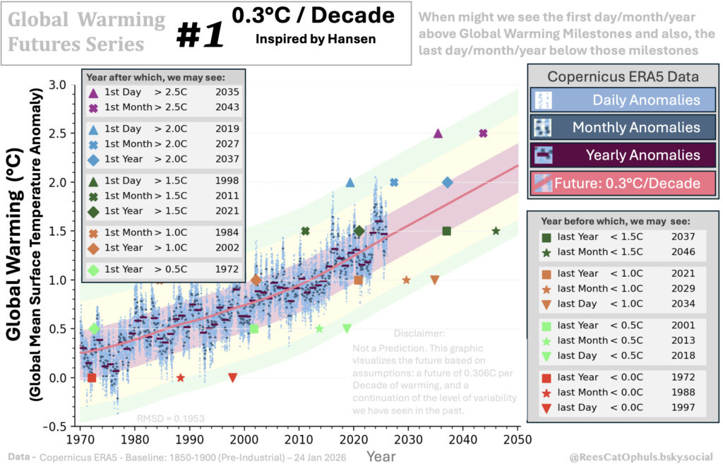
This graphic
- The Pink trend line uses Loess-30-year-window for 1970 -> late 2025 and then uses a gradient of 0.306°C / Decade until 2050
- The graph plots data (Data Sets) from Copernicus (adjusted to preindustrial baseline, as per Copernicus 1850-1900 Baseline – Daily GMST Anomaly). The graph plots daily anomalies, monthly anomalies and annual anomalies.
- The Green, Yellow and Pink bands show the ranges where we might see Daily, Monthly and Yearly Anomalies. E.g.
- all the yearly-average-anomalies should be within the red band.
- all the monthly-average-anomalies should be within the top-most and bottom-most yellow bands (including within the red band)
- all the daily-average-anomalies should be within the top-most and bottom-most green bands (including the yellow and red band)
- The Green, Yellow, Pink bands have the following logic.
- Go through all the Copernicus ERA5 data and for each day plotted on the graph, find the biggest (positive and negative) difference between the trend line and the day/month/year anomalies. This gives:
- max-daily-variation-above-trendline and max-daily-variation-below-tendline
- max-monthly-variation-above-trendline and max-monthly-variation-below-tendline
- max-yearly-variation-above-trendline and max-yearly-variation-below-tendline
- Then assume that this is the max variability for day/month/year from the trend, and draw lines which are at the max variability above/below the trend line (note the max-above is different from max-below).
- Go through all the Copernicus ERA5 data and for each day plotted on the graph, find the biggest (positive and negative) difference between the trend line and the day/month/year anomalies. This gives:
- Calculate the “Root Mean Square Difference” (a standard maths function) for all the existing Copernicus ERA5 data and the trend lines for those days.
- Pot markers, for the first/last time that a day-anomaly/month-anomaly/year-anomaly will be seen. Do this for (0.0°C, 0.5°C, 1.0°C, 1.5°C, 2.0°C, 2.5°C, 3.0°C)
- Add a table to show the years at after which we can see these anomalies for the first time, and before which we might see them for the last time
See GWFS – 1 – Hansen, where I have documented a graph from James Hansen’s work, and how this “0.3°C / Decade” is derived from that work, and included checks / sanity tests.
#2 Global Warming – Quadratic Future – Inspired by Leon Simons and Eliot Jacobson
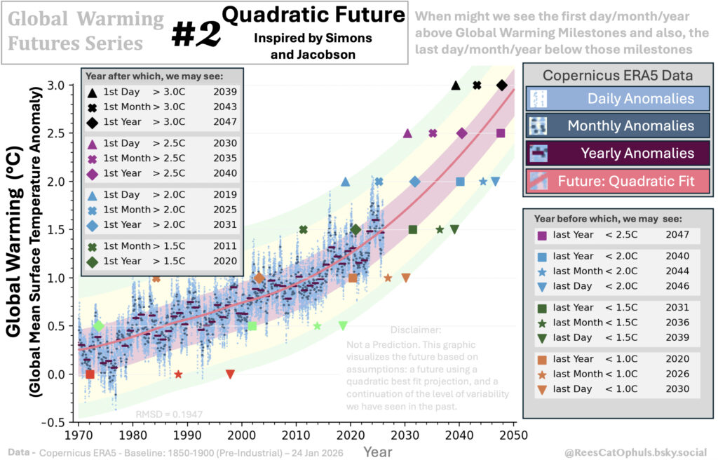
See Section #1 above, which explains the format of the graphics. This “Quadratic Future” graph has the same logic, however it calculates a “Quadratic Future” line:
- Calculate the Quadratic Best fit using ERA data
- The Quadratic Best Fit is calculated using the 1995 -> Sep 2025
- Trend line on the graphic uses
- Loess-30-year-window from the 1970 -> July_2000 data
- Quadratic Best Fit from Aug 2000 -> 2050
See GWFS – 2 – Quadratic, where I have documented a graphs posted on BlueSky by Leon Simons and Eliot Jacobson, and how this “Quadratic Best Fit” graphic is derived from that work, and included checks / sanity tests.
#3 Global Warming – Highest Ambition – Inspired by State of Cryosphere Report 2025
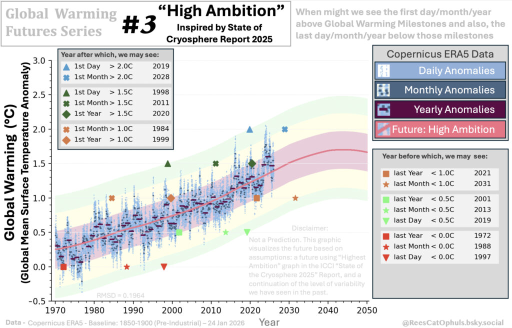
See Section #1 above, which explains the format of the graphics. This “Highest Ambition” graph has the same logic, however it calculates a “Highest Possible Line” line based on:
- The Trend line uses Loess-30-year-window from 1970 -> 2017
- From 2017 onwards, three different quadratic equations are used, which closely track the “Highest Possible Ambition” projection included in the “State of the Cryosphere Report 2025” https://iccinet.org/statecryo25/, https://doi.org/10.1038/s43247-024-01761-5
See GWFS – 3 – Highest Possible Ambition, where I have documented a graphs posted on BlueSky by Leon Simons and Eliot Jacobson, and how this “Quadratic Best Fit” graphic is derived from that work, and included checks / sanity tests.