This page shows how I created the diagram which is “Inspired by James Hansen” and his “Global Warming Acceleration” newsletters and his “Global Warming in the Pipeline” paper.
This is part of a series (Global Warming Futures Series), where I take a global warming trend, suggested by a well known scientist / organisation, and make some assumptions about the “maximum variability from the trend”, to get a diagram which suggests (if the trend holds true) when we might get the first days/months/years above different global warming milestones.
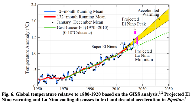
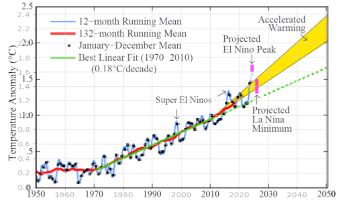
Stage 1- “Acclerated Warming” Image from Hansen
Stage 2 – Calculate Middle Warming Gradient
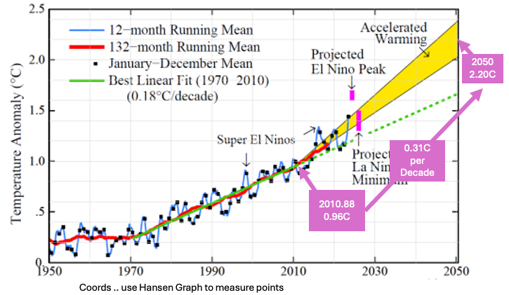
Take the original, find the coordinates for the point of the yellow wedge and the 2050 midpoint. This shows a warming of 0.31C per decade as the middle of the road.
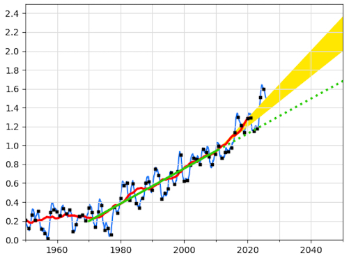
Step 3 – Create my own Version with GISS Data
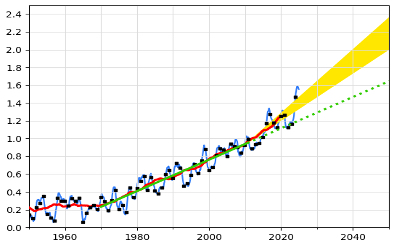
Using MatPlotLib, and the Giss data (Data Sets – See GISS data), I recreated the Diagram by Hansen
… And then overlayed my version / hansen’s version:
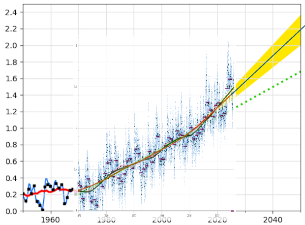
Step 4 – Create same diagram with Copernicus Data
For this Global Warming Futures Series, I want to work with Copernicus Data (See Data Sets and Copernicus data), as it gives me the daily values. I used the same code to generate this graph, as the code I used to create the GISS data version.
Step 5 – Overlay real data with my copernicus hansen
Next plot real copernicus ERA-5 data (daily, monthly, yearly, loess-15-year, loess-30-year), and overlay that over my “copernicus version of the hansen diagram”. This shows that the “Loess-30-year” line has a gradient very similar to the middle of the yellow wedge. Calculating directly from the Loess-30-year data, from where the yellow wedge starts until Octover 2025, this gives a warming gradient of 0.30576C / Decade (which is similar to the mid-point I calculated from Hansen’s diagram).
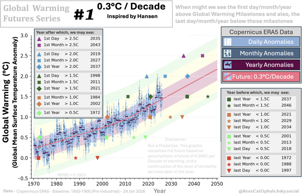
Step 7 – Create the “Global Warming Future Series – Hansen” version
So this image above:
- The idea is:
- We have found a proposed rate at which the global temperature is warming
- We can see the max variation from the trend (vertical distance from the trend line, to the actual daily/monthly/yearly anomalies)
- So if we assume the max variation won’t change, and for the purposes of the diagram, assume the trend will continue.
- Then we get a rough guess regarding when we might start seeing days/months/years over 2C, 2.5C … etc..
- And we also get a rough guess regarding when we will no longer see days/months/years below a given milestone.
- The Trend line is:
- loess-30-year trend from calculated from 1940-present, but plotted 1970 until November 2025.
- After November 2025, it extends the line at 0.306C / Decade until 2050
- Add the real copernicus data for daily anomalies, monthly anomalies, yearly anomalies (relative to 1850-1900 baseline)
- The Red shaded area:
- Represents where annual average temperatures would be expected (In this case inspired by Hansen we are assuming a global warming rate of just over 0.3C / decade).
- The line at the top of the red shaded area, is created by:
- For each year, what is the biggest positive difference between the trend line, and the actual average years in the data. E.g. 2024 is the furthest year above the trend line, so the top of the red area is that much above the trend line.
- The line at the bottom of the red shaded area, is created by:
- For each year, what is the biggest negative difference between the trend line, and the actual average years in the data. E.g. 1977 is the furthest year below the trend line, so the bottom of the red area is that much above the trend line.
- The Yellow shaded area:
- Represents where monthly average temperatures would be expected
- The line at the top of the yellow shaded area, is created by:
- For each month, what is the biggest positive difference between the trend line, and the actual average months in the data. E.g. a month in 2016 is the furthest month above the trend line, so the top of the red area is that much above the trend line.
- The line at the bottom of the yellow shaded area … ( you should get the picture by now)
- The Green shaded area:
- Represents where daily average temperatures would be expected
- The line at the top of the green shaded area (you should be able to work this out …)
- Now, start calculating, when you might see the first days/months/years over a given milestone … and start calculating, when you are no longer going to get days/months/years under a given milestone.