This page shows how I created the diagram which is “Inspired by Leon Simons / Eliot Jacobson – Quadratic Future”.
This is part of a series (Global Warming Futures Series), where I take a global warming trend, suggested by a well known Analyst / Scientist / Organisation, and make some assumptions about the “maximum variability from the trend”, to get a diagram which suggests (if the trend holds true) when we might get the first days/months/years above different global warming milestones.
Stage 1 – The original
I’m not sure who fist started pointing out that a quadratic fit was pretty good, for 1995 onwards, but I picked it up, either from Leon Simons or Eliot Jacobson.
Leon Simons – Quadratic Best Fit
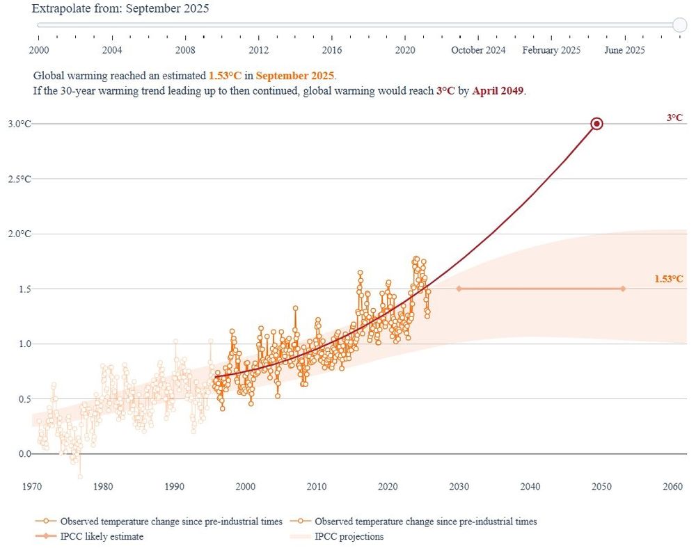
Source: https://bsky.app/profile/leonsimons.bsky.social/post/3m3q3p6ygzc25
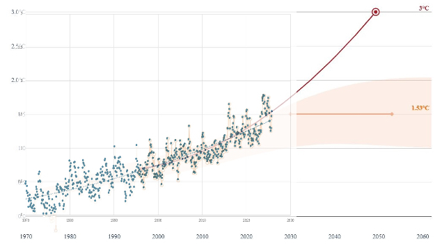
Prof Eliot Jacobson – Quadratic Best Fit
Source: https://bsky.app/profile/climatecasino.net/post/3m6d4pu3cec2m
Stage 2 – Overlay Copernicus data
This just overlays the Copernicus ERA5 monthly anomaly data that I download (see Data Sets), onto the image posted by Leon Simons.
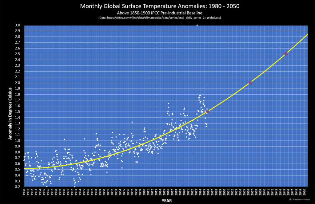
Stage 3 – Calculate Trends and Overlay again
This time, I plotted the day/month/year anomalies, and the loess-30-year-trend, and the quadratic-best-fit-from-1970-to-present. I overlayed my output with that from Leon. Match is good enough for this.
So For the trend, I will be using:
- From 1970 -> July 2000, use the Loess-30-year-trend
- From Aug 2000 -> 2050 use the quadratic best fit line:
- (0.000617965091650558 * date*date) – (2.45858656778789*date) + 2446.05792853123
- This quadratic best fit line has been calculated using the Copernicus ERA5 Data from 1995 to September 2025.
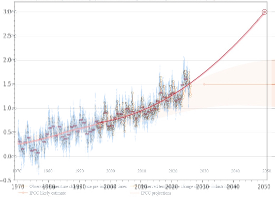
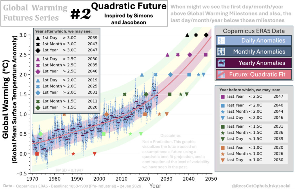
Stage 4 – Create the Quadratic Future
As per the text above, the trend line (“Future: Quadratic” pink link) is:
- From 1970 -> July 2000, use the Loess-30-year-trend
- From Aug 2000 -> 2050 use the quadratic best fit line:
- This quadratic best fit function has been calculated using the Copernicus ERA5 Data from 1995 to September 2025.