This page shows how I created the diagram which is “Inspired by the State of the Cryosphere Report 2025” (https://iccinet.org/statecryo25/, https://doi.org/10.1038/s43247-024-01761-5) and the “Highest Possible Ambition” warming graph (itself created by “Climate Analytics”).
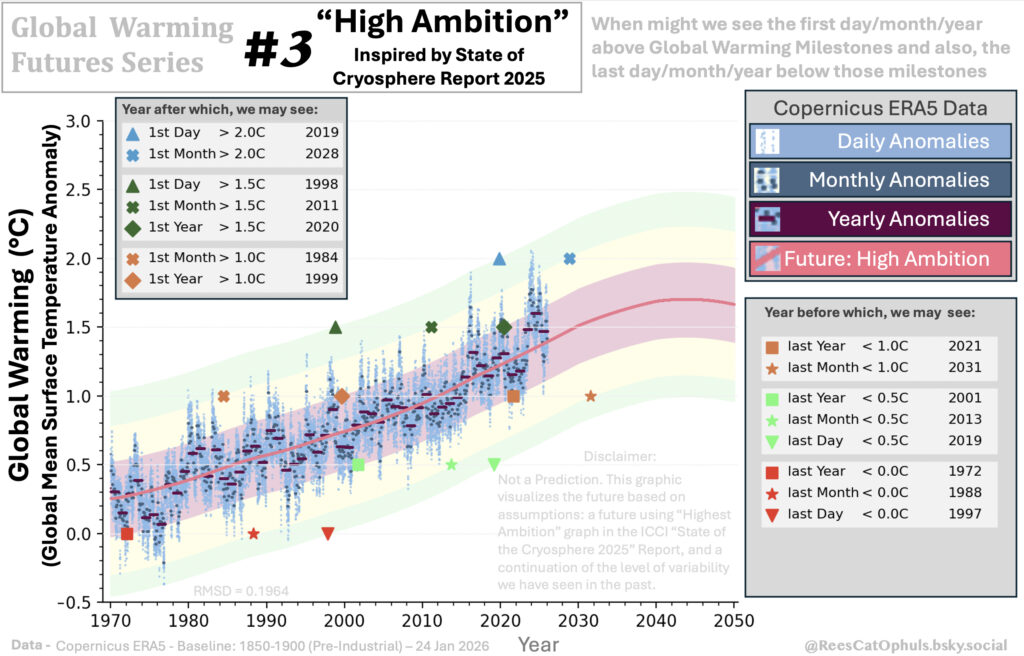
This is part of a series (Global Warming Futures Series), where I take a global warming trend, suggested by a well known scientist / organisation, and make some assumptions about the “maximum variability from the trend”, to get a diagram which suggests (if the trend holds true) when we might get the first days/months/years above different global warming milestones.
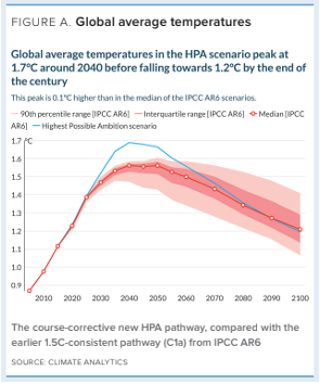
Step 1 – Get the original “Highest Possible Ambition”
Take a screenshot of the “Highest Possible Ambition” (HPA) scenario, showing temperatures from 2010 to 2100. The blue line at the top is the “HPA” line.
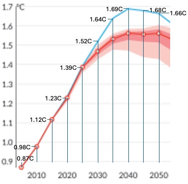
Step 2 – Zoom in and annotate
Zoom into the 2010 -> 2050 period, and annotate the temperature for every 5 years.
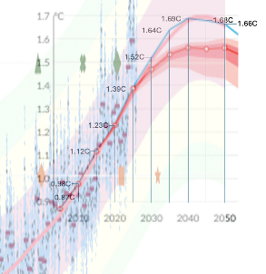
Step 3
I did some analysis, and best line fitting, and decided to go with the logic below, which is the Loess-30-year line until 2017, followed by three different quadratic equations
- Set the Trend line to be:
- 1970 -> 2017 – use the Loess-30-year window
- 2017 -> 2030
- Anomaly = (0.000171 * date * date) – (0.66402 * date) + 644.7991
- 2030 -> 2040
- Anomaly = (-0.000543 * date * date) + (2.22768 * date) – 2283.0293
- 2040 -> 2050
- Anomaly = (-0.000999 * date * date) + (4.08564 * date) -4173.487
Below is the output. You can see the red/pink line isn’t too bad as a match for that from the original.
Step 4 – The output