This page gives examples of graphics that use alternative baselines, and how you can use the tables on Global Warming Baseline Adjustments, to adjust the graph y-axis numbers to give you the numbers relative to 1850-1900.
Copernicus Baseline Adjustment
Examples: Convert Copernicus 1991-2020 baseline to 1850-1900
The examples below show how to get “Paris Agreement” global warming values.
For example, take a graph which has a baseline (such as 1991-2020), and adding a value to get “Paris Agreement” global warming anomalies. E.g. adjustments, to give you the values for a “Pre-Industrial” baseline. (E.g. 1850-1900).
Example: Single Month of September 2024, baseline 1991-2020 -> Preindustrial
This graph below, says “+0.7C” with 1991-2020 baseline (Note this is just 1 decimal place accuracy, so could mean 0.65C -> 0.74C).
As per table above, this is an individual month (September), for the Copernicus ERA5 ECMWF dataset.
So we need to add “0.814C”. E.g. using the 1850-1900 “Pre-Industrial” baseline, the September 2024 anomaly is: 1.514C. Actually, not the best example. Looking at the real data (GMST Data Sets), the anomaly for September 2024 was 0.723C relative 1991-2020, so the anomaly relative 1850-1900 was 1.537C, which better matches the picture lower down, where Copernicus said it was 1.54C.
Well, I think this is all about rounding 1dp vs 2dp vs 3dp. I’ll leave this example here though.
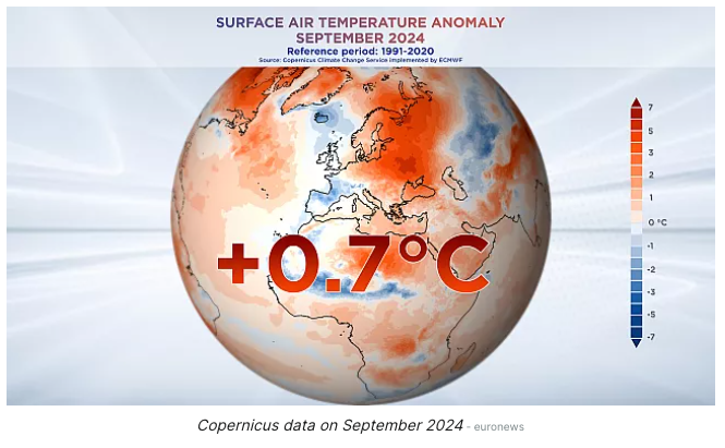
Ref: Ref-Cop-1991-2020-Sep
Example: Multiple Single Months, baselined 1991-2020 -> Preindustrial
This example is a bit more complex. Look at the two images below. They have the same data, but one is baselined to 1991-2020 and the other is baselined to 1850-1900. You can see that the lower image has a more pronounced “dip” in the middle months. As per the table at the top of this page, and the graph + trig-function on Copernicus 1850-1900 Baseline – Daily GMST Anomaly , this is actually expected because the months have different differences. To move from the anomalies in the top graph, to the bottom graph, you would have to add +0.960C to every January data point (for each line) and _+0.8.14C for every September data point (for each line).
E.g. compare to a similar graph, which uses the same data, but is baselined to pre-industrial (1850-1900)
Ref: Ref-Cop-1991-2020-Jan, Ref: Ref-Cop-1991-2020-Feb, Ref: Ref-Cop-1991-2020-Mar, etc..
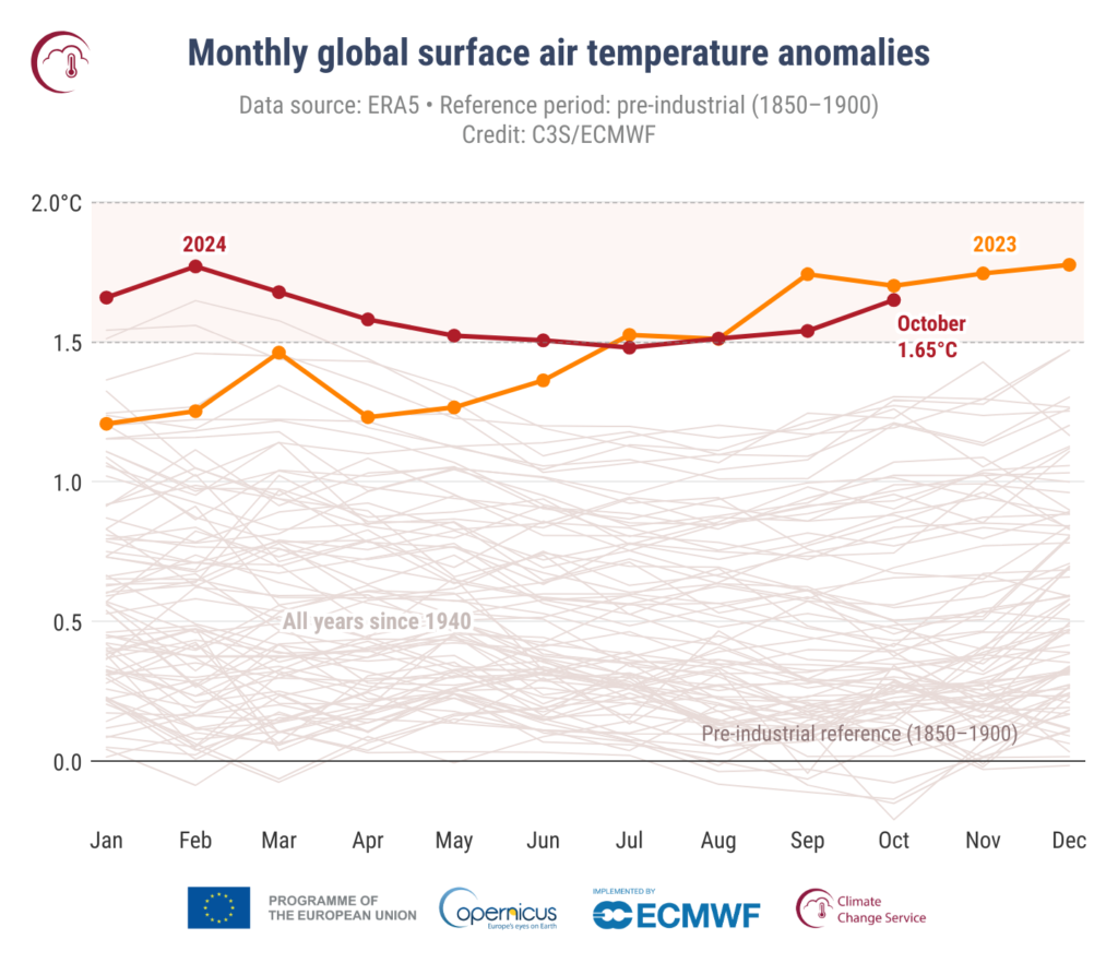
Copernicus 1991-2020 baseline
Examples: Convert Copernicus 1991-2020 baseline to 1850-1900
The graph below … The alt text for the image was: “The first graph is a 12-month running mean of global mean surface temperature anomalies. Anomalies are computed relative to a 1991-2020 baseline using ERA5 data“
Examples: Convert Copernicus 1981-2010 baseline to 1850-1900
NASA GISS TEMP Baseline Conversions
Examples: Convert GISS TEMP 1880-1899 baseline to 1850-1900
Note that this won’t be a particularly big adjustment, as GISS baseline is a subset of the “Pre-Industrial: 1850-1900 baseline”
NASA GISS 1880-1910

NASA GISS 1851-1980
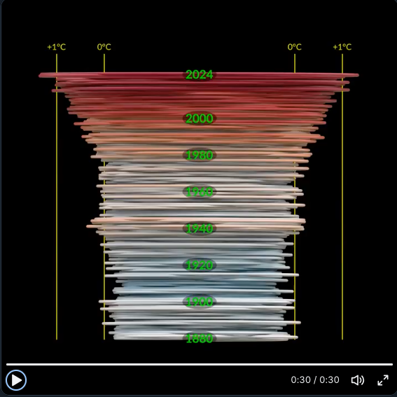
The diagram/video above comes from the page, which (as below) states that it’s baseline is 1951-1980
NASA GISSTEMP – 1980 – 1999 Baseline
NOAA
NOAA – baseline 1971-2000
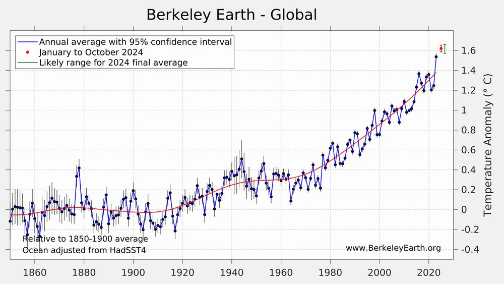
Berkeley Earth
Berkeley Earth 1850-1900

Berkeley Earth 1850-1900
Japan Meteorology
JAMA Example 1991-2020

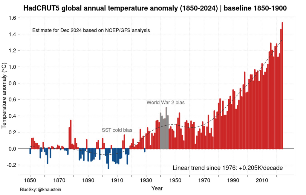
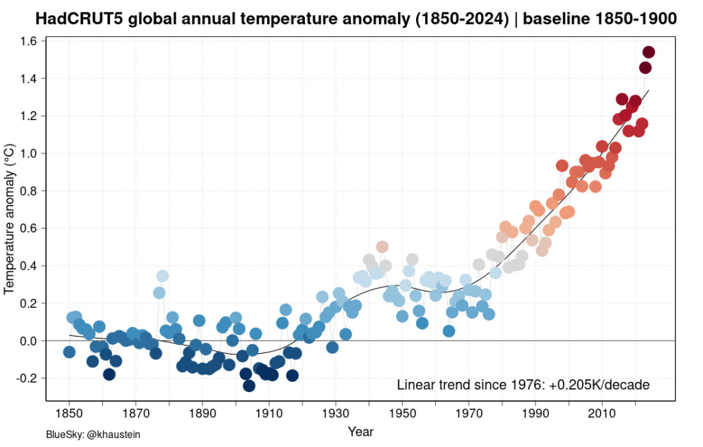
HadCRUT
HadCRUT – 1850-1900 baseline
WMO
Other
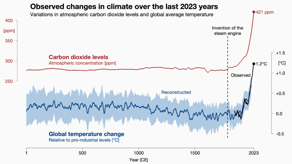
Observed – last 2023 years – preindustrial
Below, by Ed Hawkins, who I think Favours HadCRUT, as he is UK based. But I’m not sure!
Observed Temperatures – Baseline 1850-1900 – Mixed datasets