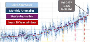
Annoyed with the “we haven’t crossed 1.5C yet” arguments, I wanted to create a graphic which bridges the gap between individual days over 1.5C and when the longer term trendlines get there.
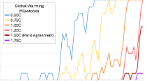
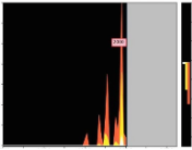
I was wondering how many cumulative days we had been above different global temperature milestones
It shows that we are likely to have experienced around 1000 individual days where the global temperature anomaly is above 1.5, by the time the “Loess-30-year-window” trend reaches 1.5C
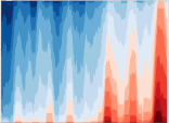
Complicated animated graphic, showing how the global average temperature is occurring at a different time of year, compared to historic. … and how it could progress into the future
I notice that the “date the loess 30 year trend line crosses an warming milestone” seemed to shift way more than I was anticipating. As new months of data were added, the trend line for the last 15 years moves enough to shift the “date the loess 30… ” by around 18 months.
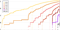
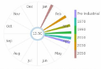
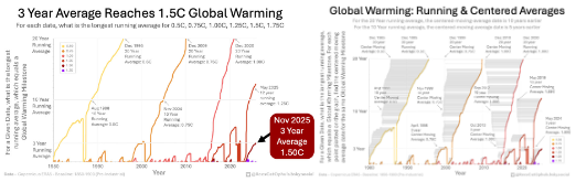
I noticed that the 3-year-running average GMST Anomaly was nearing 1.5C.
That lead me to thinking of a new graphic: For each date, what was the longest running average period, that was 01.5C. … And similar, longest running average period, that was 1.0C.
So this graphic shows that. E.g. it shows that in December 2009 the 20 year running average was 0.75C
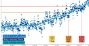
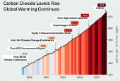
Added in Nov 2025, as an update to a classic. It shows the CO2 levels (ppm) increasing in the atmosphere (1975 -> 2025), The warming stripes (#ShowYourStripes) with a vertical coloured bar per year, and annotates the dates for various global climate conferences, protocols, agreements.
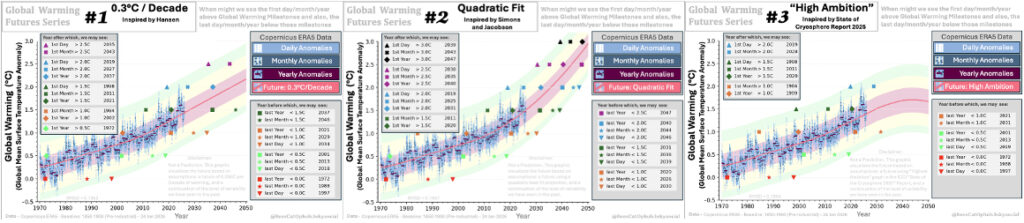
I was wondering, if the variation we have had in the past, and I try different projections, when could we get the 1st day over 2C, and the last year under 1.5C.