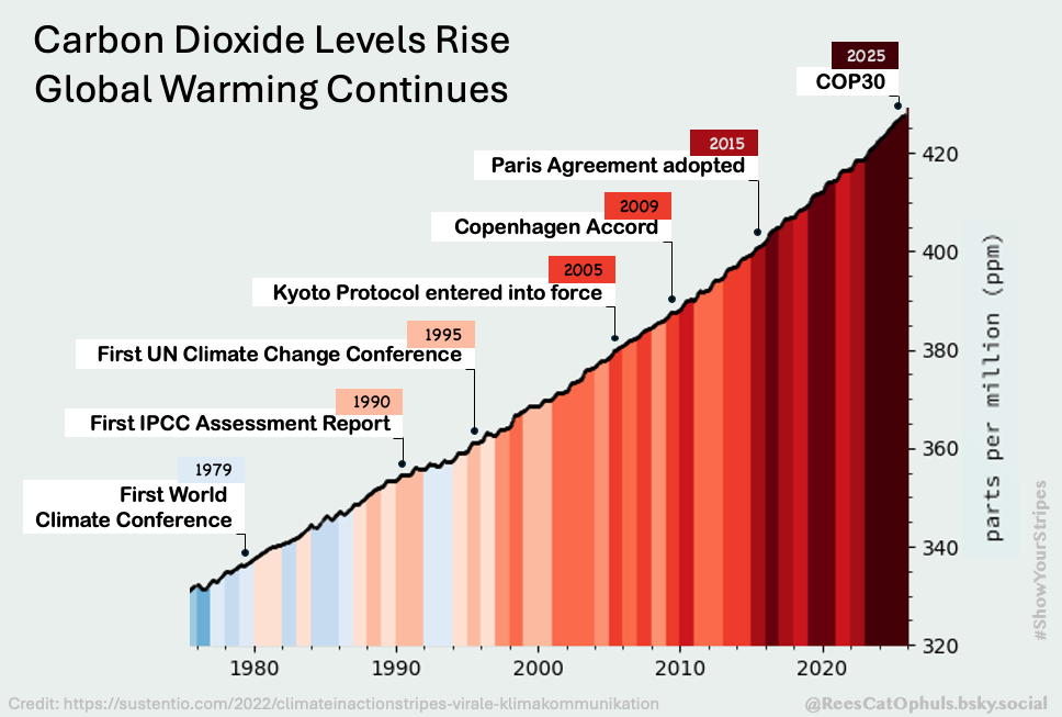
An Update to a classic
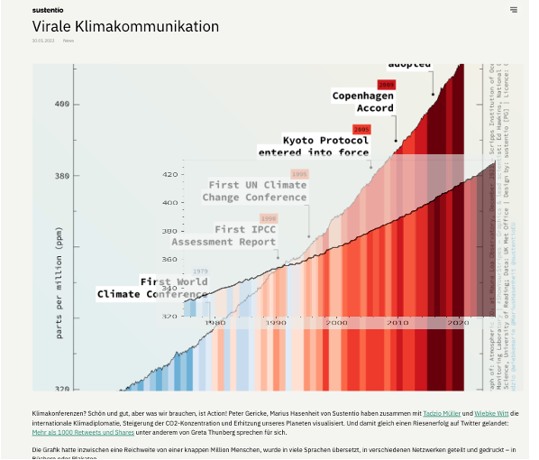
The original “Climate Inaction Stripes” graphic was designed by: Peter Gericke, Marius Hasenheit, Tadzio Müller, Wiebke Witt, and is available at https://sustentio.com/2022/climateinactionstripes-virale-klimakommunikation
Tadzio Mueller posted my version of the update here:
https://steady.page/de/friedlichesabotage/posts/b583b7fd-65f1-4f5d-83a1-a468f7e621a4
… and on BlueSky. E.g. (https://bsky.app/profile/tadziomueller.bsky.social/post/3m5im2l45pk2s).
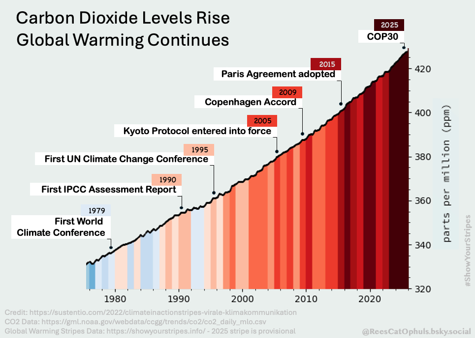
How it was made
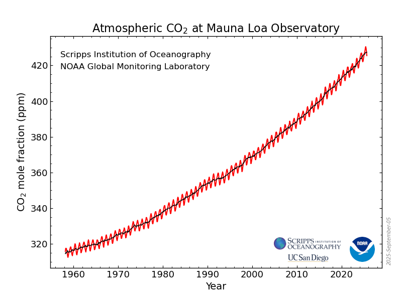
Took the CO2 data from NOAA: https://gml.noaa.gov/ccgg/trends/data.html
Took the warming stripes from: https://showyourstripes.info/
Took the dates / events from a post by Tadzio Mueller (https://bsky.app/profile/tadziomueller.bsky.social/post/3m5giurpi7k2f), and checked them in google. Added the COP30 date
Sanity Checks
I used the CO2 data from NOAA (https://gml.noaa.gov/webdata/ccgg/trends/co2/co2_daily_mlo.csv), and then applied some smoothing (broadly 12 month averaging and then sampling do reduce number of data points). This smooths off the saw-tooth edges and gives a smoother line, which is similar to the one in the original graphic.
I used the “Warming Stripes” from Ed Hawkins and the University of Reading, from the website: https://showyourstripes.info/
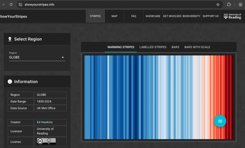
… and then for the Warming stripes, I zoomed in, to the Warming stripes image, to just get 1975 to 2024.
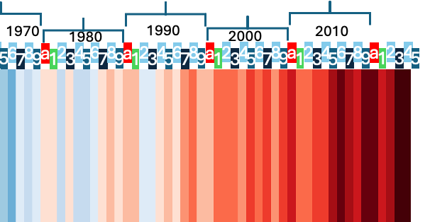
Given that we are mid November, it looks super unlikely that 2025 (at this level of accuracy) will be different from the 2023 / 2024 colours. I added the 2025 stripe in, with the same colour as 2023/2024. That is a bit of an assumption, although Gavin Schmidt (NASA GISS Director) and Zeke Hausfarther (Berkeley Earth) have both posted that 2025 will be very close to 2023.
And then after creating the graph, do an extra overlay to check that everything is lining up. It lines up perfectly.
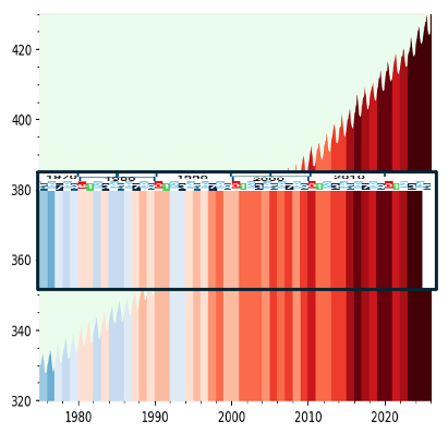
Now compare it with the original from https://sustentio.com/2022/climateinactionstripes-virale-klimakommunikation, as posted by Tadzio Mueller. Pretty good. Not perfect, but the Met Office / HadCrut data do keep changing their numbers as new studies come in (including adjusting how warm they thought it was in 1850s). I think the fact my graph matches the current warming stripes website is more important.
And the original / new, side by side
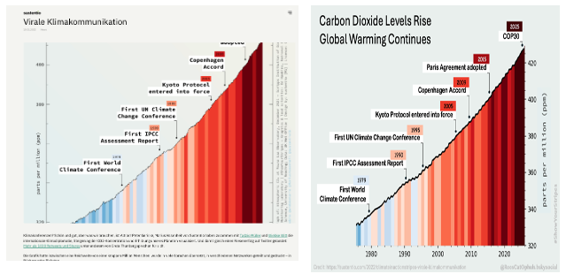
There are some differences. The Original went back a decade earlier. The NOAA data I used, only went back to 1975. The new one includes up to 2025 (note that 2025 is provisional, but unlikely to change, as we have data up to mid November, projections for the rest of the year, and at this granularity the colour is likely to stay as is). In the side-by-side image above, I squished the new one to get it to overlap the original. Overall I’m happy with the results.
A different version, which just adds the data sources onto the graphic
Update 2026
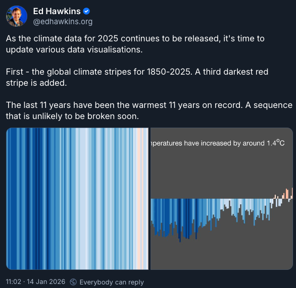
Ed Hawkins added a message in BlueSky, which confirmed that 2025 would be the same colour as 2023 and 2024. This means the image which I created in Nov 2025 can (as expected) remain unchanged. I’m still waiting for https://showyourstripes.info/ to be updated for final final confirmation.