Pre October 2024, I used a home-made smoothing function, which had its issues, and was also poorly labeled in the graphs.
I was looking for something that wasn’t too jumpy, and appeared to believably run through the data.
- Running Average
- Easy to calculate
- By definition, when the data goes up, the running average will always be below the data points.
- By definition, when the data goes down, the running average will always be above data points.
- The longer the period (E.g. 1-month-running mean, 6-month-running-mean, 120-month):
- The smoother and less jumpy the line
- The further removed the line will be from the data (if the data goes up / down)
- Centre Moving Average
- Easy to calculate
- Overlays the data points nicely
- The longer the period (E.g. 1-month-running mean, 7-month-running-mean, 121-month):
- The smoother and less jumpy the line
- The bigger gap you have at the ends (because you need X months before / after the point you plot on the graph
- My home-made smoothing
- For the middle data points of the smoothing, I took a window of 10 years either side, and then calculated the linear/quadratic best fit for this data point. Then moved to the next data point and did the same again
- For the ends of the data, I no longer had the data into the past/future, so it became closer and closer to just being linear/quadratic best fit.
- This seemed to work pretty well for the mid data points
- The end values just became pure linear/quadratic best fit points for a 10 year following/preceding window of data
- This technique with “linear best fit” for each iteration of each “window of data” was pretty good, whereas the “quadratic best fit” was more jumpy.
- I was somewhat lazy about labelling this accurately on my graphs, labelling them as “linear” or “quadratic”, which was clearly not what they were.
- Loess – x year window
- I started to notice that many scientists preferred “Loess smoothing”.
- I found a python library that did this “loess.loess_1d”
- I found that
- 50-year window of data was a bit “over smoothed”
- 15-year window of data was too jumpy, with the trend going up and down
- 30-year window was perfect for what I wanted
Retired Graphs
Following the revamp of the website to “retire” my home spun smoothing technique, and moving to “Loess-30-year-window”, I am moving the old graphs here for reference.
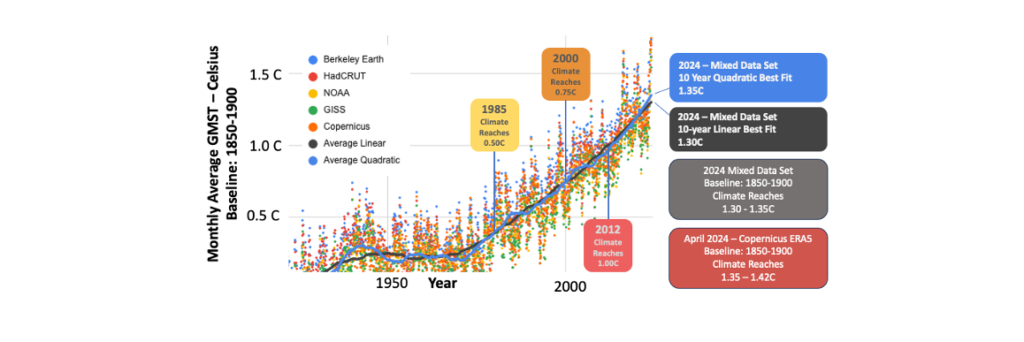
Current Climate – Value
In the original “counters” panel, I showed the “Current Climate” as being “1.35C to 1.42C” … These were effectively the values:
- 1.35C = 10-year-linear best fit for 31st March 2024
- 1.42C = 10-year-quadratic best fit for 31st March 2024

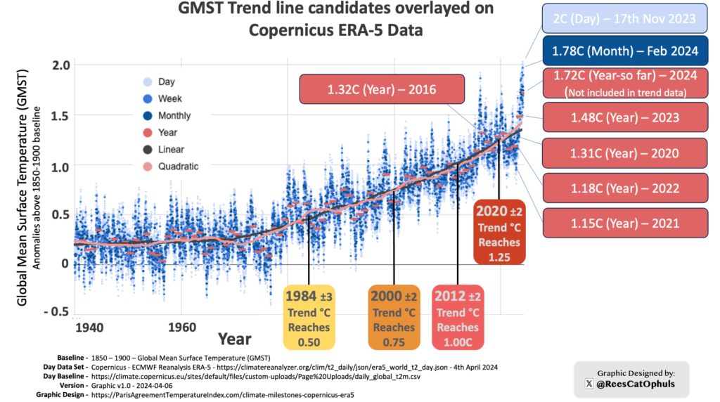
Copernicus – Trend Data
Following push back on my original 1000 Days above 1.5C before Trend passes 1.5C? graphic, I created this to show that my dates for “when the climate passed various anomaly milestones” … And I already started adding “+/- 2-3 years” to the labels. I knew my home-made trend was not perfect. That said the Black line is pretty close to the Loess-30-year-window values … slightly less so at the ends.
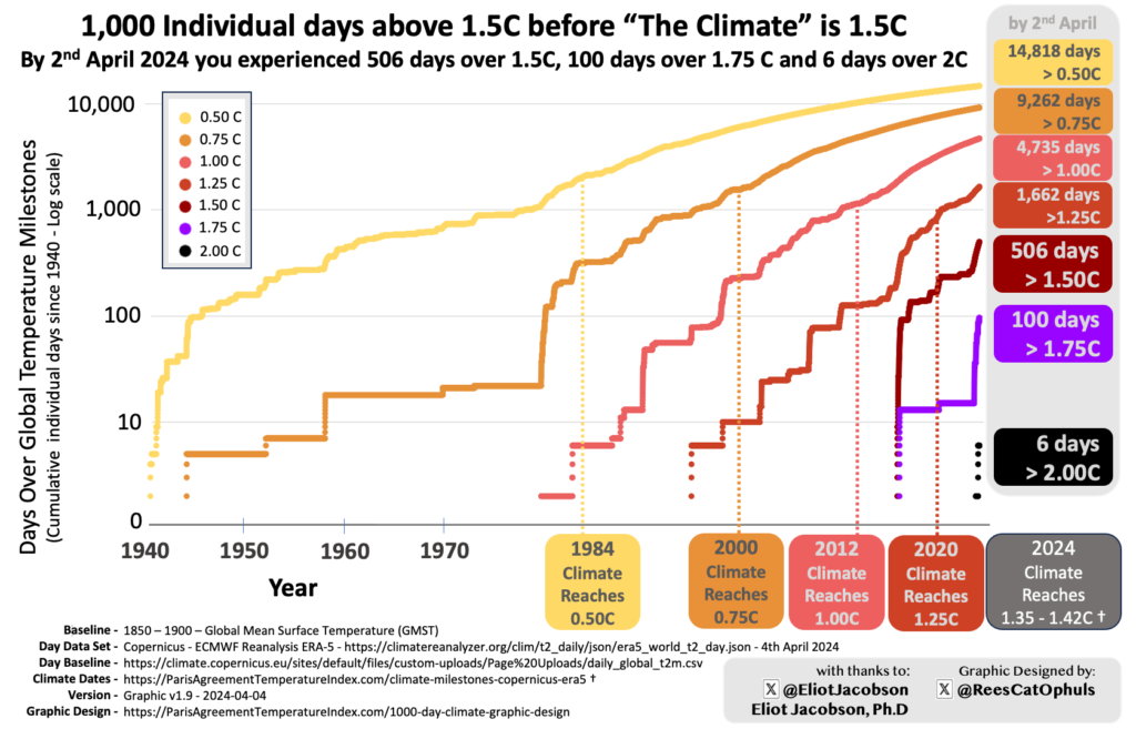
1000 days over x anomaly
Below is the first iteration of this graph. Later versions had improvements
- As per Copernicus 1850-1900 Baseline – Daily GMST Anomaly – In June 2024 I improved my handling of the Copernicus data. This makes slight changes to the counts on the right
- As per top section of this post, these “Climate Reaches <x>C” were based on my homespun smoothing lines. In later versions of this graph I switch to Loess-30-year-window. This moves the 0.5C from 1984 -> 1985, The 0.75C and 1.0C are unchanged. The 1.25C moves from 2020 -> 2021.
- The “Climate Reaches 1.35-1.42C” moves to “Loess-30-year-window is 1.35C in September 2024.
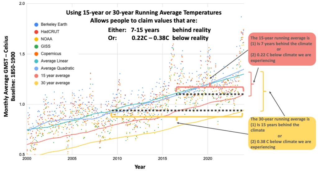
Comparing Running Average
Below, the original image has a blue/turquoise trend lines are my home-spun smoothing. I replaced this with just a single “Loess-30-year-window” single trend line, and minor updates to the values. Didn’t make a lot of difference. Also, the main point stands. Using running-average trends totally underplays the warming that the planet is actually experiencing
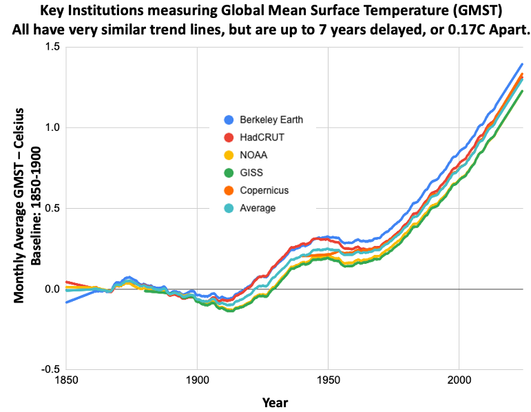
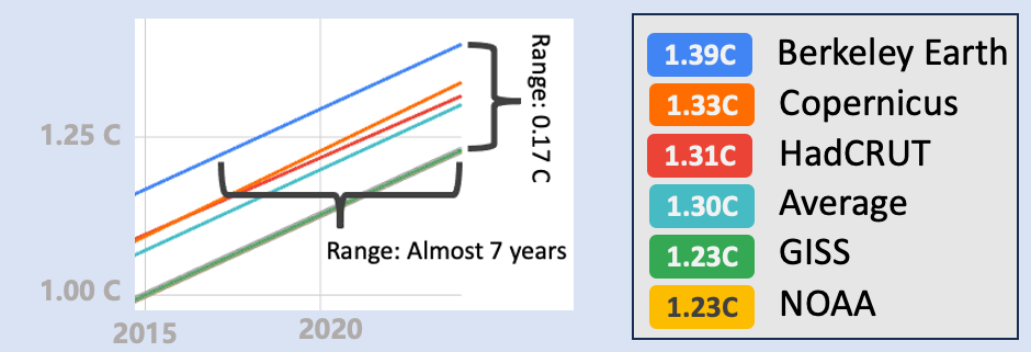
Trends for different dat sets
The two images below use my homespun smoothing technique for all the data sets that I am using.
On the main website, I have updated them to use Loess-30-year-window trends. It still tells the same story though.
All Data Trends
I have update this image on the main site, to use Loess-30-year-window smoothing line