Shows the Loess-30-year trend line moving around as new data is added.
Berkeley Earth – Crossing 1.5 – With Loess 15 year window
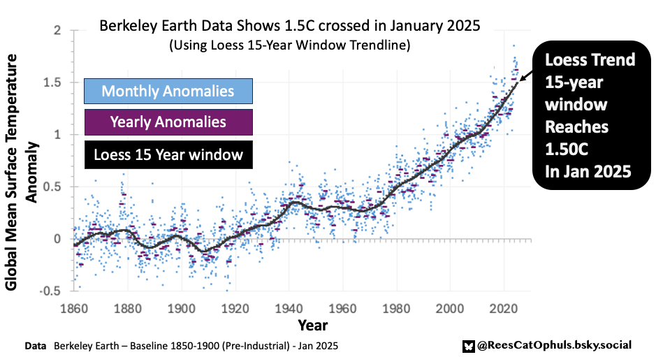
I noticed that the Copernicus 30-year-loess trend reached 1.4C … So I thought I’d check the Copernicus 15-year-loess trend which reached 1.48C … Given that Berkely Earth runs hotter than Copernicus, I thought I’d check the Berkeley Earth Data with the 15-year-loess trend… And bingo it is crossing 1.5C right now. Note that the 15-year loess is a bit jumpy, so it may drop down below again in the next months/year … before if finally settles above 1.5C permanently,.
… Now I don’t have as many data checks for Berkeley Earth, as I do for Copernicus, so I thought I’d better check it against a graph posted by Zeke Hausfarther.
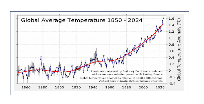
As per below I overlayed the two graphs (mine, and Zekes), and the years (Zeke = black dots), (purple line = my graph) … and it looks pretty exact. So as long as there is nothing I misunderstand about the monthly Berkeley Earth values (Note for Copernicus, as per Copernicus 1850-1900 Baseline – Daily GMST Anomaly I had a torrid time getting good results for daily anomalies) … then my graph is looking good. Happy to fix anything if people see a mistake.
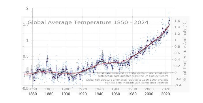
Given that this is quite a big statement, I thought I’d use a different Python Package, to give a second opinion about the Loess 15-year trend line. The graphs above use python package “loess.loess_1d”. The graph below uses python package “statsmodels.api”. Same result.
