
Data comes from Copernicus ERA5 (See GMST Data Sets and Copernicus 1850-1900 Baseline – Daily GMST Anomaly)
On 7th November 2025, the previous 365 days had:
- 100.0% days over 1.0C
- 98.4% days over 1.1C
- 94.8% days over 1.2C
- 84.9% days over 1.3C
- 69.6% days over 1.4C
- 50.1% days over 1.5C
- 34.2% days over 1.6C
- 16.2% days over 1.7C
- 3.6% days over 1.8C
- 0.8% days over 1.9C
- 0.0% days over 2.0C
You can see that the Post 2024 temperature mega surge continues to subside. By November 7th 2025, the number of days over 1.5C (for the previous 365 days) has dropped to 50%. Have we bottomed out, or are we still drifting downwards … before (me, a total lay person, guesses that) the next El Nino will fire us up to greater warming heights again.
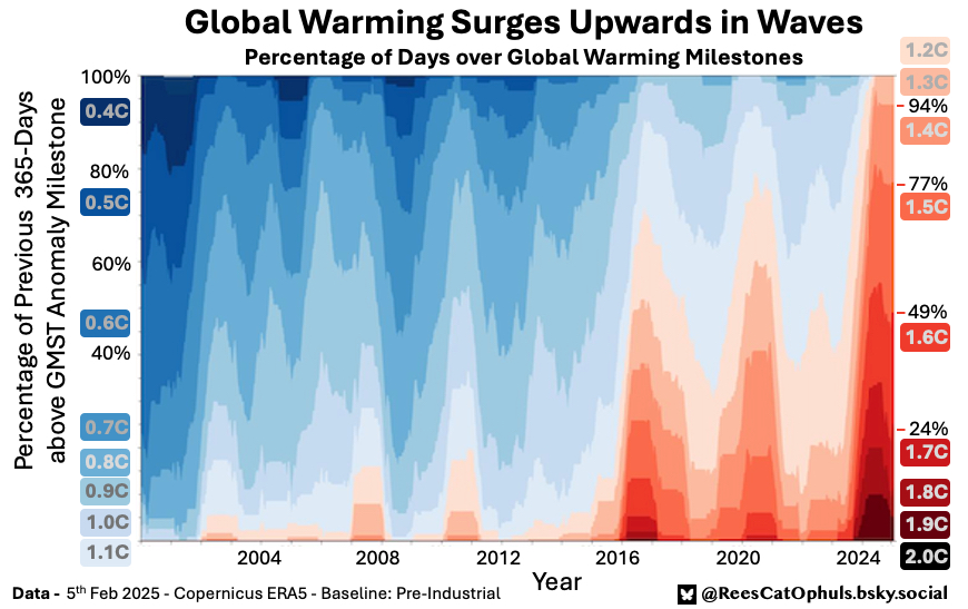
Warming Tapestry – February 2025
Details about the graphic
Data comes from Copernicus ERA5 (See GMST Data Sets and Copernicus 1850-1900 Baseline – Daily GMST Anomaly)
On 5th Feb 2025, the previous 365 days had:
- 100.0% days over 1,3C
- 93.7% days over 1.4C
- 77.0% days over 1.5C
- 49.0% days over 1.6C
- 24.1% days over 1.7C
- 8.5% days over 1.8C
- 3.6% days over 1.9C
- 1.1% days over 2.0C
You can see that the 2024 temperature surge has subsided somewhat, by February 2025 (Although Jan 2025 was the hottest Jan on record). Compared to September 2024 version of this graphic, the percentage of very hot days dropped away over the last few months. E.g. the 2.0, 1.9, 1.8, 1,7 segments have come down a bit.
The days over 1.6C and over 1.5C are holding strong for now. I guess we’ll see if La nina finally gets the temperatures dampened down, or whether the earth energy imbalance (due to aerosols, narrow clouds, whatever it turns out to be) keep the heating high.
This graphic is an update, to the one I posted in September 2024, which covers details of how the graphic was created.
Version 1 – Posted in September 2024
Below is the first version I posted
Interesting Notes on the Graphic
- 2023 and 2024 have been incredible
- The surge and fall-back over a 3-8 year period shows up very clearly
- The El Nino 2016 really shines through
- The Triple-dip Lan Nina of 2021 -> early 2023 clearly pulls down the values
- The most recent 365-days up till 31st Aug 2024:
- 100% of days over 1.3C
- 94% of days over 1.4C
- 79% of days over 1.5C
- 20% of days over 1.8C
- 10% of days over 1.9C
- 2% of days over 2.0C (6 days, so 1.64% to be more accurate)
- As per the Key Climate Indicators, (and indeed general economic growth plans), I (an interested lay person), see zero reason why this trend wouldn’t continue for the next 10 years, so I expect some time around 2027-2032 to be wild. My guess would be:
- First day over 2.25 by 2028
- First month over 2.25 by 2032
- First individual year over 1.75 by 2030
- TODO: will come back and do less finger-wavy guesses, and put some better values in.
- The surge and fall-back over a 3-8 year period shows up very clearly
Motivation for Graphic
I continue to try and bridge the gap between long term Global Temperature Anomaly averages, and how we experience them day-by-day. In this case, I noticed in early April that every single day in 2024 had been over 1.4C, and in February 2024 we had 4 individual days over 2.0C.
I had previously created a graphic at the monthly level (°C Milestones – From First Appearance to Permanence), but it only makes sense to update that every year. I was looking for something which can be updated more frequently. This graphic could be updated daily, but probably only interesting to to so every few months, to see how the lines have gone up and down.
How the Graphic was created
The underlying data is the Copernicus ERA-5 data (see GMST Data Sets).
As per the rather dull article (Copernicus 1850-1900 Baseline – Daily GMST Anomaly), I have worked out how to get daily GMST anomalies which use the 1850-1900 baseline.
The rest is fairly simple. For a given day (E.g. 31st August 2024), grab the 365 most recent daily GMST anomaly values. Get the percentage of those 365 days that are over 0.4C, 0.5C, … 1.5C, 1.6C, … 1.9C, 2.0C. E.g. 31st Aug 2024 gives you:
- 100% of the last 365 days are over 1.3C
- 94% … over 1.4C
- 79% … over 1.5C
- 55% … over 1.6C
- 34% … over 1.7C
- 20% … over 1.8C
- 10% … over 1.9C
- 2% … over 2.0C (6 days, which is 1.64%, which rounds to 2%)
Then do the same for every day in the range you are interested in. In this case I was interested in every day from 1st Jan 2000 until 31st Aug 2024.
So you now have data series for each GMST Anomaly from 0.4C -> 2.0C
Plot each of these data series using the colour-fill from “Show your stripes” from https://showyourstripes.info/ to fill below each data series line’
- 8 – #67000d – Warmest
- 7 – #a50f15
- 6 – #cb181d
- 5 – #ef3b2c
- 4 – #fb6a4a
- 3 – #fc9272
- 2 – #fcbba1
- 1 – #fee0d2 – Least warm (of the red colours)
- 1 – #deebf7 – Least cold (of the blue colours)
- 2 – #c6dbef
- 3 – #9ecae1
- 4 – #6baed6
- 5 – #4292c6
- 6 – #2171b5
- 7 – #08519c
- 8 – #08306b – Coldest
After this, I just added some labels to make it easier to see what GMST anomaly each colour is.