The Paris Agreement talks about staying under 1.5°C and 2°C of global warming above the “Pre-Industrial” baseline. As per Baseline Adjustment Examples, people often show graphs with a different baseline (E.g. 1991-2020). This page provides conversion tables, so you can quickly add an adjustment to convert the Y-Axis to get pre-industrial values. See Baseline Adjustment Evidence to see how the adjustment values were sanity checked against publications by trusted institutions. As per About, these are “best efforts”, and I will update them (see Errata) if necessary.
Quick and Dirty Baseline Adjustments
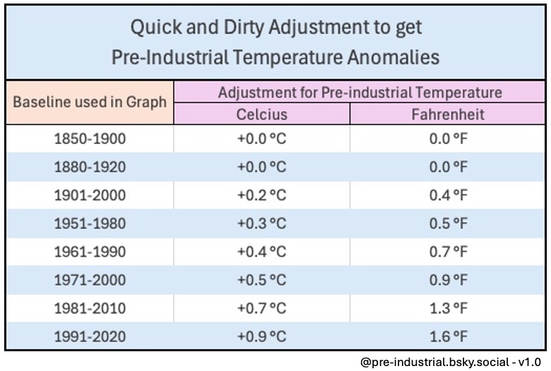
The table above, is intended to give a very rough number, so you can take a graph of global temperature anomalies, which is baselined to something other than pre-industrial (as per Paris Agreement I’m using 1850-1900 to be “Pre-Industrial”), and lookup the adjustment needed. E.g. if the graph you are looking at is using the 1951-1980 baseline, then add “0.3°C” to the Y-axis numbers to get the pre-industrial equivalent.
Baseline Conversions – Specific to a given dataset
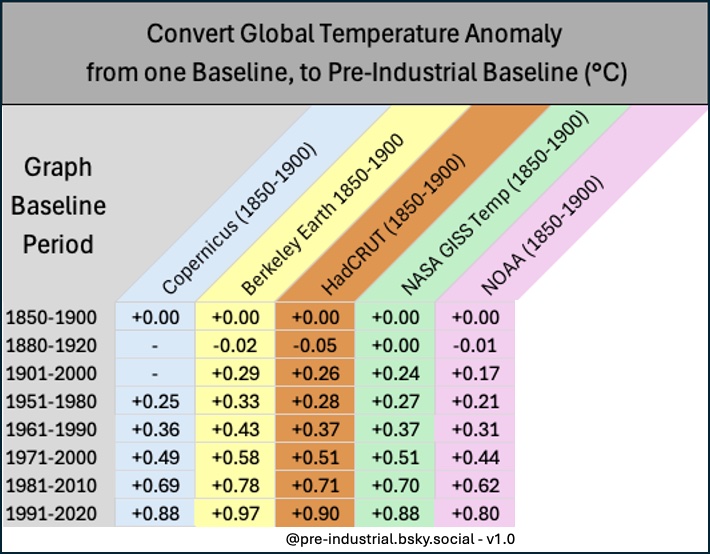
The table above, is a slightly more detailed table, compared to the “Quick and Dirty Adjustment Table”.
This table:
- Is useful for comparing “whole years” e.g. global warming of 2024 relative to 1991-2020.
- If the graph is for less than an entire year (E.g. “warming in October”, or “warming jan-sept), then this isn’t accurate enough. It won’t be that far off.
- Uses 2 decimal places (More accurate)
- Also takes into account the dataset which the table is using (Copernicus / Berkeley Earth, etc…).
E.g. if the baseline is 1981-2010, and the dataset used is “Copernicus ERA5” (See GMST Data Sets), then add 0.88°C to the Y-Axis numbers to get the anomalies relative to Pre-Industrial.
E.g. if the baseline is 1981-2010, and the dataset used is “HadCRUT5” (See GMST Data Sets), then add 0.71°C to the Y-Axis numbers to get the anomalies relative to Pre-Industrial.
Convert Copernicus 1991-2020 baseline to Copernicus 1850-1900
The table below is specific to Copernicus ERA-5 Data, who ofter prefer the 1991-2020 baseline for their graphics. The previous adjustment tables (sections above), are useful when comparing complete years. With ERA-5 Data, you need to watch out for plots which are for individual months. Look at Examples for Baseline Adjustment (search for “Ref-Cop-1991-2020-Jan”), and you will see the “year to date” graph has a slight difference from the “Monthly Anomalies” graph. Notice the difference in how low the curve goes in June/July. See also Copernicus 1850-1900 Baseline – Daily GMST Anomaly for why things are different if you compare whole years, vs individual months.

Convert Copernicus 1981-2010 baseline to Copernicus 1850-1900
This is the same as the previous graph, and is specific to Copernicus ERA-5 data, but uses the 1981-2010 baseline

Evidence:
See Baseline Adjustment Evidence (and search for the “Evidence Reference” E.g. “Ref-Cop-1991-2020-Sep”), to for links to published articles, which confirm that the Baseline adjustment values in the table above are correct. Let me know if you dispute any of the values, by posting on BlueSky (See About page)
Examples
See Baseline Adjustment Examples (and search for the “Evidence Reference” E.g. “Ref-Cop-1991-2020-Sep”). I don’t have examples for every variant, but enough to get the idea.
The examples below show how to get “Paris Agreement” global warming values.
For example, take a graph which has a baseline (such as 1991-2020), and adding a value to get “Paris Agreement” global warming anomalies. E.g. adjustments, to give you the values for a “Pre-Industrial” baseline. (E.g. 1850-1900).