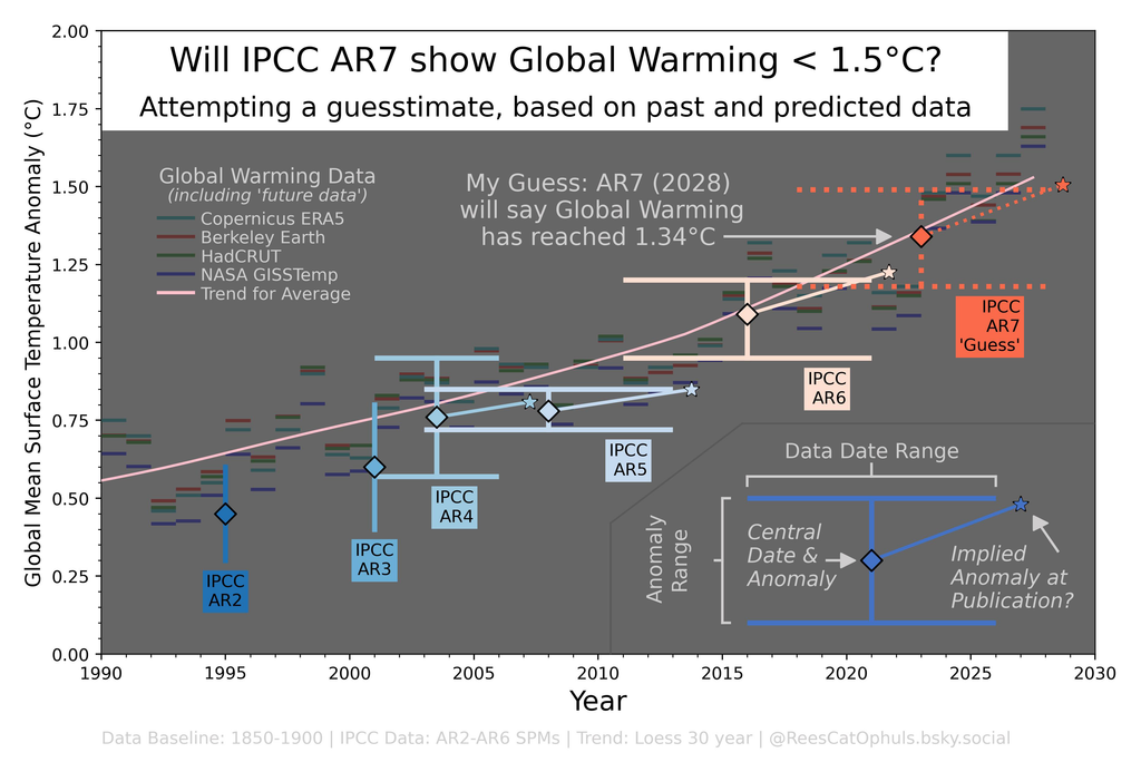
Given that ever more ways to measure global warming show that we are crossing 1.5°C global warming, I wondered what the upcoming 2028 IPCC “Assessment Report 7” (AR7) Report might say.
I thought I would look back at the previous IPCC Assessment Reports (AR2 -> AR6), and compare these
to the global warming data from popular datasets. Given that high profile authorities have given Global Warming estimates for 2026 and 2027, I wondered if this would lead me to a reasonable guesstimate for the Global Warming figures that will be published in AR7.
(Note Update Oct 14th 2026: https://www.theguardian.com/environment/2026/oct/13/ipcc-pressure-delay-publication-climate-report-ar7-cop33 – The guardian reports that there is pressure to delay IPCC AR7. Lol. Yikes. Oh well, for now I will continue to assume that it will be published around Aug 2028).
I have used global Warming Datasets: Copernicus ERA5, Nasa GISS, Berkeley Earth, Met HadCRUT, and plotted the yearly global warming anomalies. I also took the average for each year and plotted the Loess-30-year-trend for the average values. For the “future data” I have assumed 2026 will be the same as 2024, and 2027 will be 0.15°C warmer than 2024.
Conclusions
- When the IPCC publishes the central global warming value in an Assessment report, it has a track record of being 5+ years behind the current reality.
- When the IPCC publishes gives hints about how fast it thinks we are warming, it has a track record of being shown to be an underestimate within a few years.
- My guesstimate (assuming they use the same methods): IPCC AR7 will say we are around ~1.34°C warming at ~0.29°C/Decade
- Note as per post by Dr Aaron Thierry (https://bsky.app/profile/thierryaaron.bsky.social/post/3mxpq7xfzys2l), Nature has published (https://www.nature.com/articles/s41612-026-01561-y) article which includes the statement (“identify a statistically significant doubling of the global warming rate during 2011–2025 (0.40 °C per dec) compared to 1971–2025 (0.20 °C per dec)”)
- The concept of this graph, was much more fun to come up with, than going through all the steps to actually create it, and verify/document the data sufficiently (including the realisation that between their 2024 and 2025 reports, Berkeley Earth reassessed how cold they think it was in pre-industrial times). I found that there is more subjectivity to this than I originally expected. I should revisit my life choices regarding the amount of effort I put in. Please read more about what the graphic means, and what decisions were made before giving any feedback.
How the Graph was created and what it means
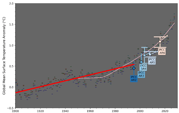
The graph has four main elements:
- (1) Annual Global Warming data from world class datasets: Berkeley Earth, Nasa Giss, Copernicus ERA5, UK Met Office HadCRUT. Note this includes “Future Data”, where I assume that, for each dataset, 2026 will be the same global warming value as 2024, and 2027 will be 0.15°C warmer than 2024.
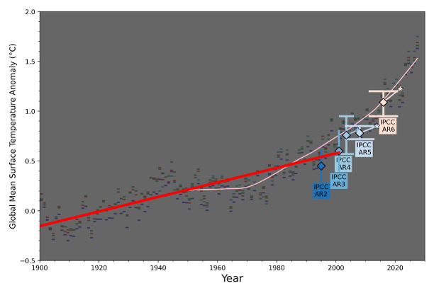
- (2) Trend line, taking the average for each year, and then creating a Loess-30-year-average trend line. This includes the “Future Data” for 2026 and 2027.
- (3) Graphical Shapes that try to show the Global Warming values reported in the IPCC Assessment Reports.
- (3A) The IPCC Reports tend to state a range of dates, and a range of global warming values, so I plot the central global warming value as well as the global warming ranges, and the date ranges. I also plot the global warming rate from the IPCC Report, and thereby show what the IPCC implied global warming value would likely be at the time the report was actually published.
- (3B) For AR2 and AR3, there is no date range supplied, so they just have vertical lines. This may not be fair to the IPCC?
- (4) Graphical Shape which makes a guess at what values will be published in IPCC AR7 in mid 2028 (if indeed the IPCC end up publishing AR7 in 2028).
Graphical Shape for AR4, AR5, AR6 and guess-for-AR7
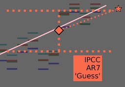
As per the key (shown below), and in the bottom right of the main diagram, these “Graphical Shapes” for AR4, AR5, AR6, and my-guess-at-AR7 show:
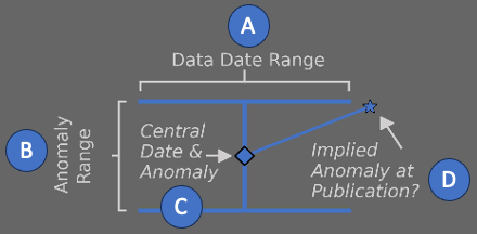
- (A) “Data Date Range”.
- If IPCC says “Global surface temperature was 1.09 [0.95 to 1.20] °C higher in 2011–2020 than 1850–1900”, then the date range will be start-of-2011 until end-of-2020 (E.g. 10 full years)
- (B) “Anomaly Range”
- If IPCC says “Global surface temperature was 1.09 [0.95 to 1.20] °C higher in 2011–2020 than 1850–1900”, then the “Anomaly Range” will be 0.95°C to 1.20°C
- (C) “Central Date & Anomaly”
- If IPCC says “Global surface temperature was 1.09 [0.95 to 1.20] °C higher in 2011–2020 than 1850–1900”, then the “Central Date & Anomaly” are “1st Jan 2016” and “1.09°C
- (D)”Implied Anomaly at Publication”
- If IPCC says “The estimated increase in global surface temperature since AR5 is principally due to further warming since 2003–2012 (+0.19 [0.16 to 0.22] °C)“, then taken together with the previous points above, this suggests that from “1st Jan 2008” until “1st Jan 2016” (E.g. the mid points of the two ranges), the earth has heated by 0.19°C … E.g. over 8 years, then implies a warming rate of “0.2375°C / decade”. So I draw a line from the “Central Date & Anomaly” rising at “0.2375°C / decade” up until the date that the IPCC report was published.
- The main point about this, is that the IPCC takes a decade long average of data, and therefore (by definition) tends to be 5.5 years behind reality, by the time it is published (because so far the globe keeps warming, which means the 10 year average will be 5 years behind, plus the extra half year before the report is published.. You can’t say the report is wrong, all you can say is that it is likely that the warming trend has broadly continued for 5.5 years since that decadal mid date/anomaly. … So we will likely be experiencing a temperature of 0.15°C-0.25°C warming than reported by the IPCC.
- E.g. when AR7 comes out with a sentence like: “Global surface temperature was 1.34 [1.18 to 1.49] °C higher in 2018–2027 than 1850–1900”, and “The estimated increase in global surface temperature since AR6 is principally due to further warming since 2011–2020 (+0.29 [0.22 to 0.35] °C)” … It is quite likely that the trend line has already reached 1.48°C (although IMHO, I think IPCC continues to understate the warming rate, so I’m going to guess the trend will actually have got to 1.55°C by mid 2028. But I’m a nobody in this space, so this is just personal prediction for me to check back in on in a few years).
Note that for AR2 and AR3 no date range is given, so I have just plotted a vertical line. Some more nuances are included lower down, in the section dedicated to those reports.
IPCC Assessment Report 6 – AR6
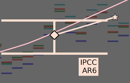
- AR6 WG1 SPM pg3: “IPCC, 2021: Summary for Policymakers. In: Climate Change 2021: The Physical Science Basis. Contribution of Working Group I to the Sixth Assessment Report of the Intergovernmental Panel on Climate Change”
- Published in August 2021
- AR6 WG1 SPM A.1.2 pg5: “Global surface temperature was 1.09 [0.95 to 1.20] °C higher in 2011–2020 than 1850–1900”
- Date Date Range: 1st-Jan-2011 until 31st-Dec-2020
- Anomaly Range: 0.95°C – 1.20°C
- Central Date: 1st Jan 2016
- Central Anomaly: 1.09°C
- AR6 WG1 SPM A.1.2 pg5: “The estimated increase in global surface temperature since AR5 is principally due to further warming since 2003–2012 (+0.19 [0.16 to 0.22] °C)”.
- E.g. 0.2375°C / Decade
- Implied Anomaly at publication date:
- Publication: Aug 2021
- Implied Anomaly at publication: 1.22°C (1.09°C + (5.66 years at 0.2375°C / Decade”)
IPCC Assessment Report 5 – AR5
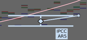
- AR5 WG1 SPM pg3: “IPCC, 2013: Summary for Policymakers. In: Climate Change 2013: The Physical Science Basis. Contribution of Working Group I to the Fifth Assessment Report of the Intergovernmental Panel on Climate Change”
- Published in September 2013
- AR5 WG1 SPM B.1 pg5: “The total increase between the average of the 1850–1900 period and the 2003–2012 period is 0.78 [0.72 to 0.85] °C, based on the single longest dataset available”
- Date Date Range: 1st-Jan-2003 until 31st-Dec-2012
- Anomaly Range: 0.72°C – 0.85°C
- Central Date: 1st Jan 2008
- Central Anomaly: 0.78°C
- AR5 WG1 SPM B.1 pg5: “rate calculated since 1951 (1951–2012; 0.12 [0.08 to 0.14] °C per decade)”.
- E.g. 0.12°C / Decade
- Implied Anomaly at publication date:
- Publication: September 2013
- Implied Anomaly at publication: 0.85°C (0.78°C + (5.75 year at 0.12°C / Decade”)
Note AR5 is surprisingly low. It is worth noting that “AR6 WG1 SPM pg 5, A.1.2” does have the sentence “Additionally, methodological advances and new datasets contributed approximately 0.1°C to the updated estimate of warming in AR6.” … so maybe that is the IPCC acknowledging that AR5 under-reported the warming? Also, AR5 covers the period when climate deniers were crowing over the “warming pause” between 2000 – 2010. Who knows … but the AR5 shape is clearly way below the trend, and by the time AR5 was published, it was over 8 years behind where the loess trend has now settled.
IPCC Assessment Report 4 – AR4
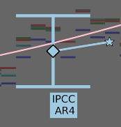
- AR4 WG1 SPM pg1: “IPCC, 2007: Summary for Policymakers. In: Climate Change 2007: The Physical Science Basis. Contribution of Working Group I to the Fourth Assessment Report of the Intergovernmental Panel on Climate Change.”
- Published in March 2007
- AR4 WG1 SPM B.1 pg5: “The total temperature increase from 1850–1899 to 2001–2005 is 0.76°C [0.57°C to 0.95°C]”
- Date Date Range: 1st-Jan-2001 until 31st-Dec-2005
- Anomaly Range: 0.57°C – 0.95°C
- Central Date: 1st Jul 2003
- Central Anomaly: 0.76°C
- AR4 WG1 SPM B.1 pg5: “The linear warming trend over the last 50 years (0.13°C [0.10°C to 0.16°C] per decade)”.
- E.g. 0.13°C / Decade
- Implied Anomaly at publication date:
- Publication: March 2007
- Implied Anomaly at publication: 0.81°C (0.76°C + (3.75 year at 0.13°C / Decade”)
IPCC Assessment Report 3 – AR3
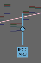
- AR3 WG1 SPM page iv: “IPCC, 2001: Climate Change 2001: The Scientific Basis. Contribution of Working Group I to the Third Assessment Report of the Intergovernmental Panel on Climate Change”
- AR3 WG1 SPM page 2: “The global average surface temperature (the average of near surface air temperature over land, and sea surface temperature) has increased since 1861. Over the 20th century the increase has been 0.6 ± 0.2°C”
- Published in May 2001
- There is no good date range, therefore I have just plotted a vertical line on 31st Dec 2000
- Anomaly Range: 0.4°C – 0.8°C
- Central Date: 31st Dec 2000
- Central Anomaly: 0.6°C
I note that the Loess trend line is at the very upper end of the AR3 vertical line. I thought that maybe this was because IPCC was assuming linear warming since 1900. So I took the 1900 -> 2001 data for Berkeley, HadCRUT, Giss, ERA5 and did a linear best fit, as below. This does give a bulls eye (linear red line goes straight through the AR3 vertical line). I’m not really sure. Also I just have a vertical line at 2001, maybe, it should be 5+ years earlier, like the way I plotted AR4, AR5, AR6. Who knows.
IPCC Assessment Report 2 – AR2
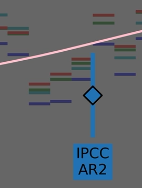
- AR2 WG1 Full Report, Summary for Policy Makers: “Contribution of WGI to the Second Assessment Report of the Intergovernmental Panel on Climate Change”
- AR2 WG1 Full Report, Summary for Policy Makers, page4: “Global mean surface air temperature has increased by between about 0.3 and 0.6°C since the late 19th century; the additional data available since 1990 and the re-analyses since then have not significantly changed this range of estimated increase.”
- Published in November 1995.
- There is no good date range, therefore I have just plotted a vertical line on 1st Jan 1995
- Anomaly Range: 0.3°C – 0.6°C
- Central Date: 1st Jan 1995
- Central Anomaly: 0.45°C
I note that AR2 seems to show temperature anomalies will below the trend, and below the temperature anomalies that were happening around the time the report was published. I thought that maybe this was because IPCC was assuming linear warming since 1900. So I took the 1900 -> 1995 data for Berkeley, HadCRUT, Giss, ERA5 and did a linear best fit, as below. This might be close to explaining it. I’m not really sure. Also I just have a vertical line at 1995, maybe, it should be 5+ years earlier, like the way I plotted AR4, AR5, AR6. Who knows.
IPCC Assessment Report 7 – AR7 – My guesstimate
This section documents my thinking on what IPCC AR7 might say:
- AR7 will be published around August 2028
- AR7 calculations for the global warming will include data between Jan-1st-2018 and Dec-31st-2027
- AR7 Anomaly will likely have the central-date, central anomaly just below the Loess-30-average line
- See Data – Loess 30 year heading lower down
- This will mean that the central global warming anomaly will be 1.34°C
- Note that this is 0.25°C above the previous AR6 1.09°C
- And AR6 central date (1st Jan 2016) to AR7 central date (1st Jan 2023) are 7 years apart
- … which implies a warming rate of 0.36°C / Decade
- … But IMHO, I’m going to guess that AR7 will understate this, to 0.29°C / Decade, because they tend to use linear best fits.
- AR7 Anomaly range … I’m just guessing here, that they will go for 0.15°C above and below
- Put this all together, my guess for AR7 is
- My Guess is that AR7 will state: “Global surface temperature was 1.34 [1.18 to 1.49] °C higher in 2018–2027 than 1850–1900”
- My Guess is that AR7 will state: “The estimated increase in global surface temperature since AR5 is principally due to further warming since 2011–2020 (+0.29 [0.22 to 0.35] °C)”
Data – Future Data Assumptions
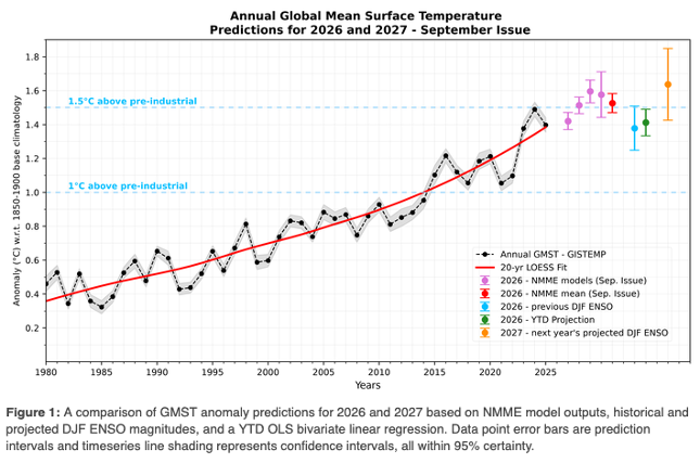
The image below was posted by Zeke Hausfarther https://bsky.app/profile/zekehausfather.com/post/3mrfkema4v72w in July 2026):
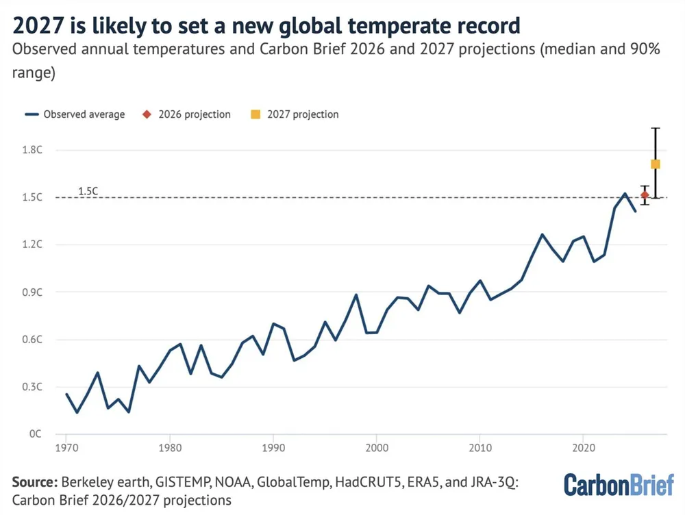
The image above shows:
- 2026 projected to be very similar to 2024.
- 2027 to be around 0.15°C – 0.2°C higher than 2024, with quite a big range.
So … for my “future data” I’m plotting:
- The data for the year 2026:
- For each dataset that I’m using (copernicus, giss, hadcrut, berkeley), assume each has the same global warming as they did in 2024.
- The data for the year 2027:
- For each dataset that I’m using (copernicus, giss, hadcrut, berkeley), assume each has a global warming, that is the same as their 2024 global warming value, and then add + 0.15°C.
Data – Sanity Check – Berkeley Earth
I have taken the data from Berkeley Earth’s report about 2025: https://berkeleyearth.org/global-temperature-report-for-2025/
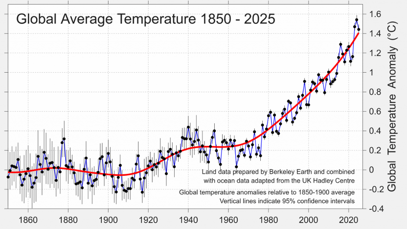
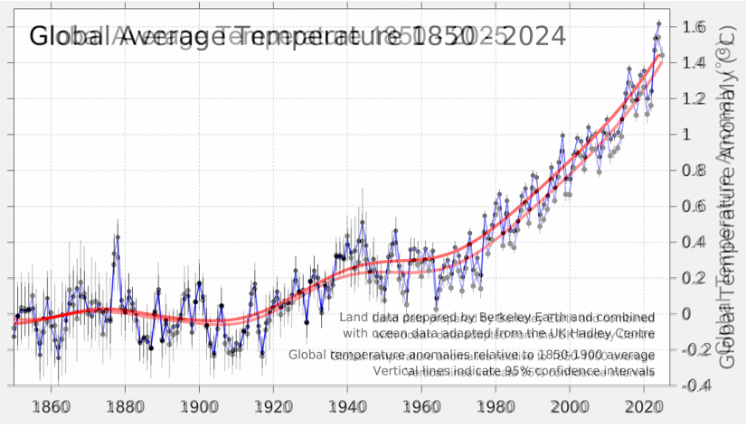
I got a bit side-tracked … because my data validation kept failing. Finally I realised (by overlaying Berkeley 2024 report (https://berkeleyearth.org/global-temperature-report-for-2024/ … with the 20205 report) that Berkeley Earth had re-evaluated how warm it was in 1850-1900, with the effect that their reporting for global warming has dropped by around 0.07°C
Leon Simons helpfully pinged Berkeley Earth’s “Robert Rohde” who confirmed the update
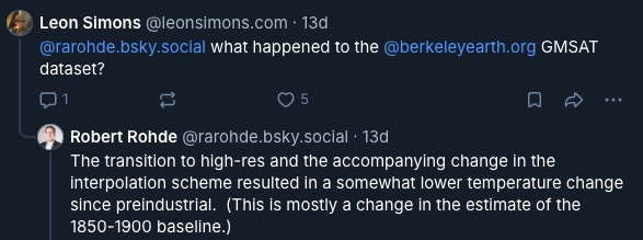
Source ^^: (https://bsky.app/profile/leonsimons.com/post/3mwykcw4lws2c)
I actually gave up on trying to download an official data file, and used a tool which helped me pull the data from the image
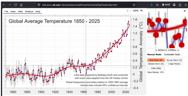
I then overlayed the data I pulled off the image with the image itself. It is close enough for the purposes of this work.
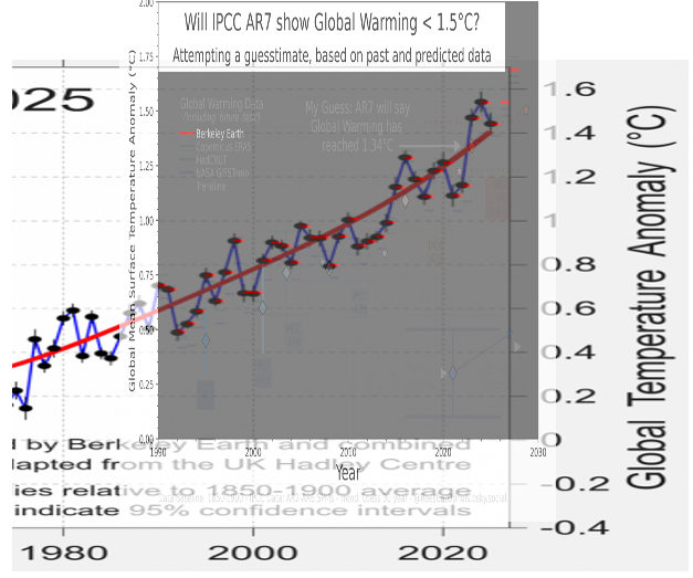
As per a section above: For 2026 I assumed it would be the same as 2024. For 2027 data, I assumed it would be 0.15°C higher than 2024.
Data – Sanity Check – Copernicus
Copernicus posted annual global warming data (https://climate.copernicus.eu/copernicus-2025-was-third-hottest-year-record)
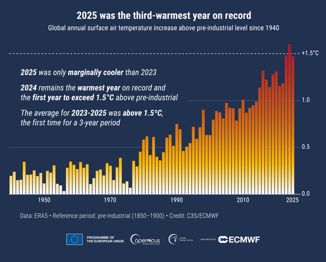
As per GMST Data Sets … I download and process the Copernicus data. Below I overlay the data I downloaded from Copernicus, with their own graph.
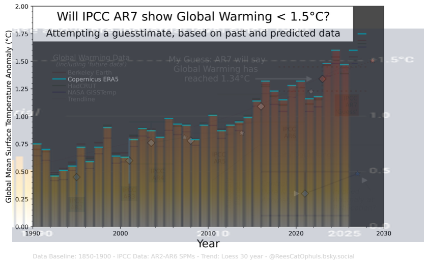
As per a section above: For 2026 I assumed it would be the same as 2024. For 2027 data, I assumed it would be 0.15°C higher than 2024.
Data – Sanity Check – GISS
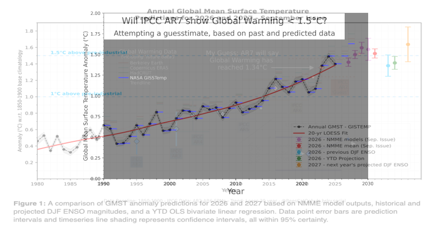
Nasa GISS normally post graphs using baselines “1880-1920”, or “1951-1980”. But here, they post one with a 1850-1900 baseline (https://data.giss.nasa.gov/gistemp/gmsta/).
Here I overlay the data I downloaded from Nasa GISS (See GMST Data Sets)
As per a section above: For 2026 I assumed it would be the same as 2024. For 2027 data, I assumed it would be 0.15°C higher than 2024.
Data – Sanity Check – HadCRUT
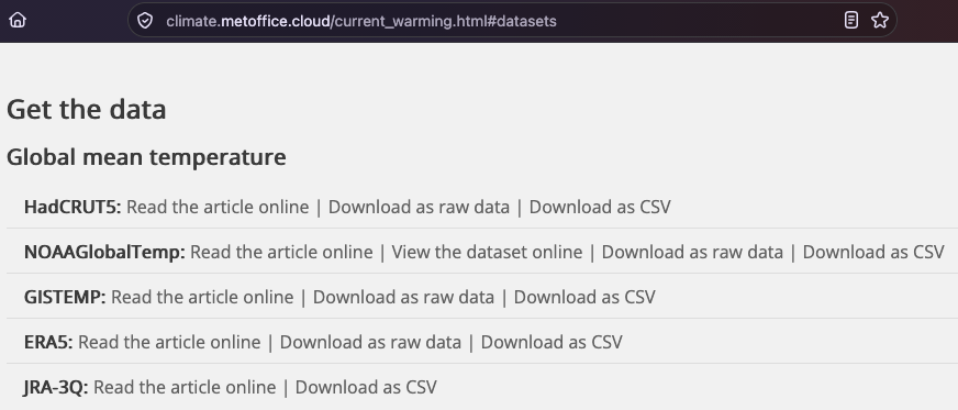
For HadCRUT, I actually downloaded the data from the Met Office (https://climate.metoffice.cloud/current_warming.html#datasets), which has some mixed datasets:
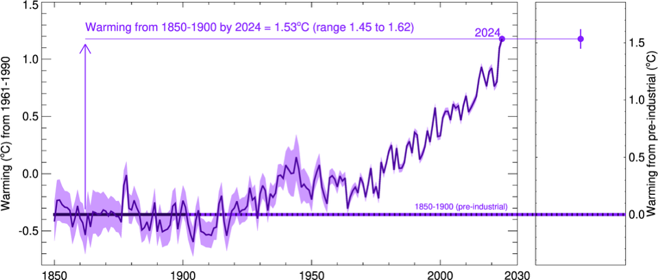
And then I compared it with this graph from HadCRUT (https://crudata.uea.ac.uk/cru/data/t2024/prelim.htm), which although is baselined to 1961-1990, it has an extra line for the 1850-1900 baseline
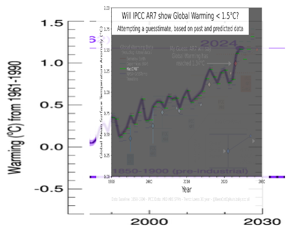
So when I zoomed into the 1990-present, and did an overlay, it is good enough for this graphic
As per a section above: For 2026 I assumed it would be the same as 2024. For 2027 data, I assumed it would be 0.15°C higher than 2024.
Average Of Data – Loess 30 Year
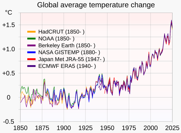
The “Loess Trend” takes the average yearly anomaly for the four datasets (Copernicus, HadCRUT, Berkeley Earth, Nasa GISS), and then for those average yearly anomalies, it calculates the Loess Trend with a 30 year window.
If you look at a graph which shows many of the popular Global Warming datasets (https://commons.wikimedia.org/wiki/File:20200324_Global_average_temperature_-_NASA-GISS_HadCrut_NOAA_Japan_BerkeleyE.svg)
And overlay my graphic with this:
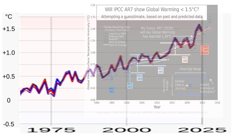
This passes the sniff test. Seems about right.
Models Favourite Quote
As per a post from Gavin Schmidt (https://bsky.app/profile/climateofgavin.bsky.social/post/3ldtuvcql3k2s):

… although to be fair for this piece of work, I’m only using projected data for the end of 2026 and all of 2027. This quote is more relevant to some other work: Global Warming Futures Series ,